Day vs. Night: What NYC’s Population Looks Like

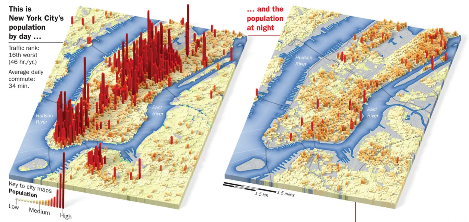
New York may be the city that never sleeps, but it certainly pulsates far differently depending on what time of day it is. This fascinating map created by Joe Lertola gives us an idea of just how population-filled areas of Manhattan get during working hours, and how the city empties out at night when most workers head back to their homes in the suburbs.
Pretty much every area of Manhattan sees a drop in population when night falls with the exception of the Upper East and West Sides, the Lower East Side and Williamsburg, all largely residential areas. You can also see an interesting little spike happen on Roosevelt Island.
The image was created in 2007 for the U.S. government using LandScan U.S.A., a program developed by the Geographic Information Science and Technology group at the Oak Ridge National Laboratory. By punching in the latest Census data with detailed information on daily activities, the program’s algorithm can predict the population distribution of any location at any time of the day.
Although the map is a several years old, it’s hard to imagine that these long-standing habits have changed much in the last few years. The only differences we feel need to be accounted for are the rise in residents in Brooklyn’s now-hot neighborhoods and the Financial District, as well as the increase in the average person’s commute time.
[Via Amazing Maps via Marginal Revolution]
RELATED:


