Where I Work: Harlem’s Focus Lighting illuminates the field of architectural lighting design
6sqft’s series “Where I Work” takes us into the studios, offices, and off-beat workspaces of New Yorkers across the city. In this installment, we’re touring the Harlem office of architectural lighting design firm Focus Lighting. Want to see your business featured here? Get in touch!
After spending many years designing theatrical lighting, Paul Gregory decided to transition into the world of architectural lighting. He started his career working on nightclubs and in 1987, founded his own firm in his neighborhood of Harlem. Eight years later, Paul and his team at Focus Lighting garnered international recognization for their work on the Entel Tower in Santiago Chile, the world’s first automated color-changing building. Since then, the firm has grown to have 35 employees and nabs commissions such as the Times Square ball, Tavern on the Green, and the Waldorf Astoria (and that’s just here in NYC).
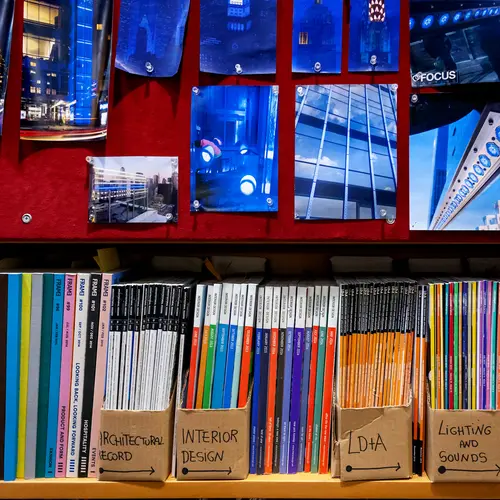
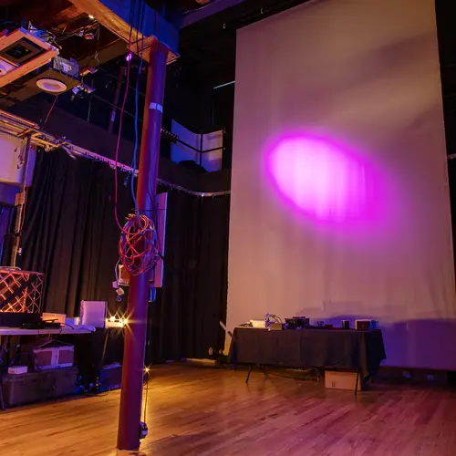
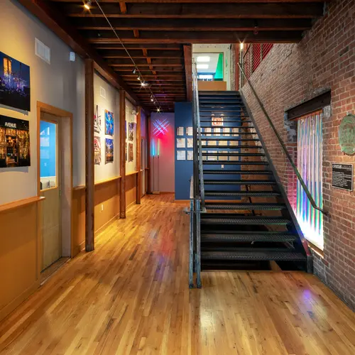
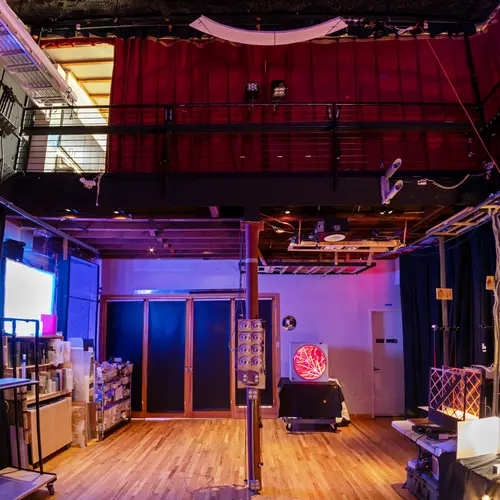
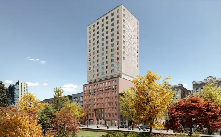
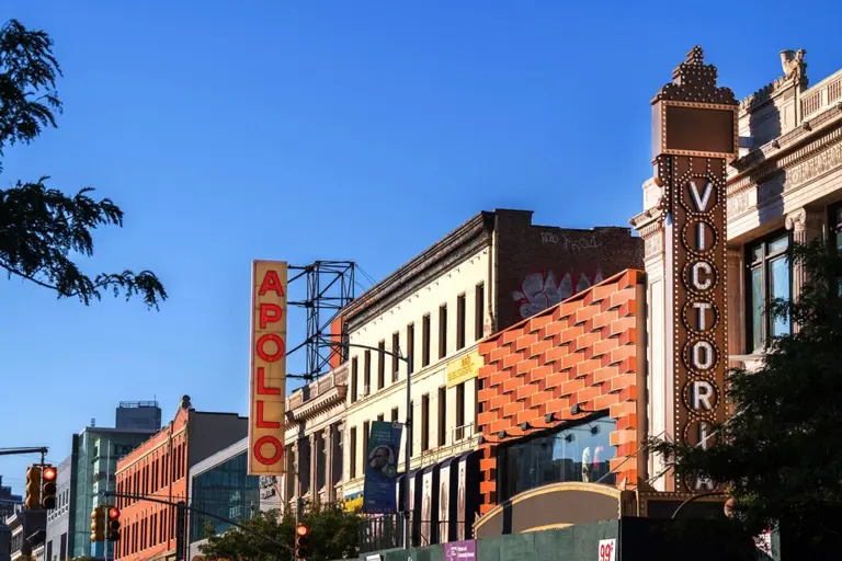
But through all their success, Focus has kept their offices in Harlem, now at 116th Street and Adam Clayton Powell Jr. Boulevard, where their close-knit employees work collaboratively. The converted loft space has a unique light lab, similar to a black box theater, as well as a gallery space where the team can test out new means of digital architecture and video projects. 6sqft recently visited Focus Lighting to learn more about their fascinating work, tour the space, and chat with Focus partner and principal designer Brett Andersen and principal designer Christine Hope.
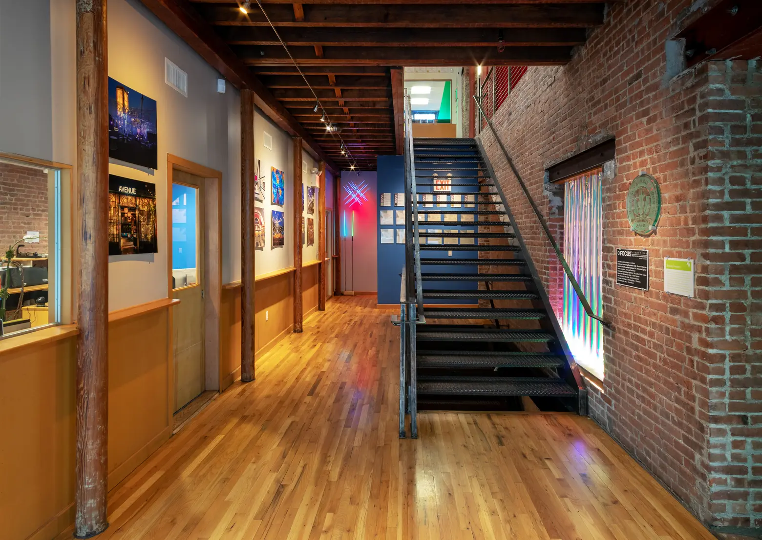
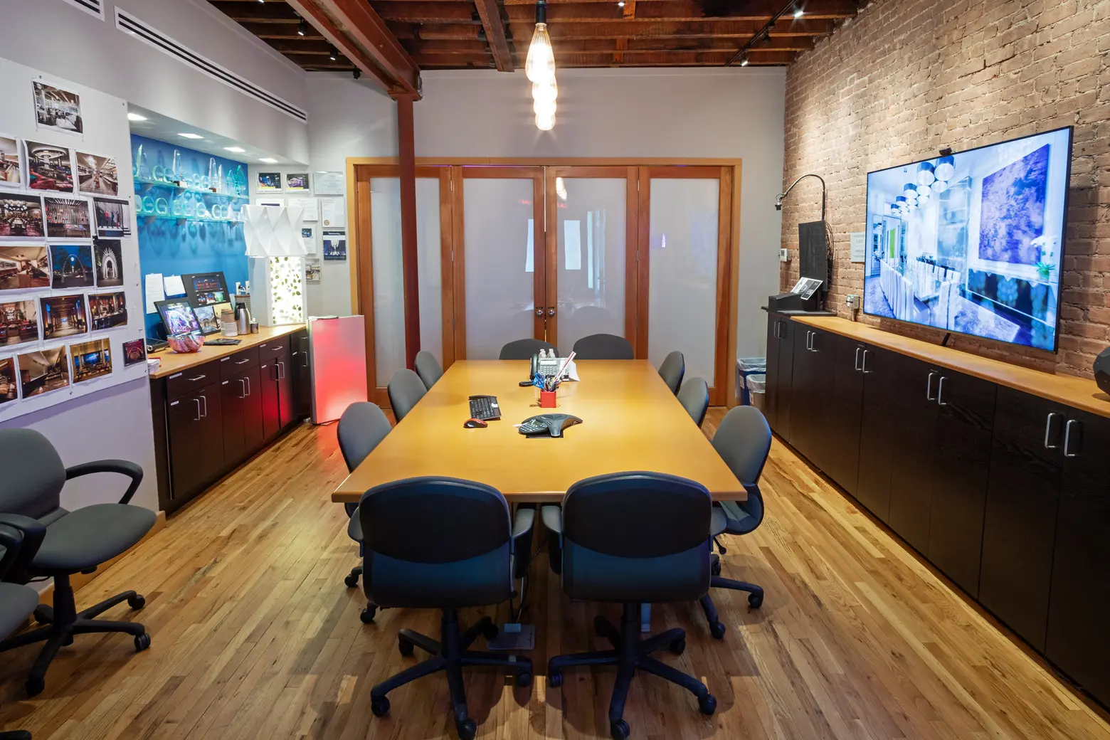
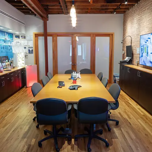
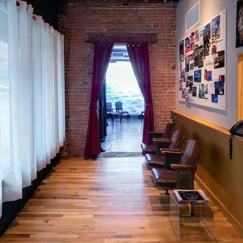
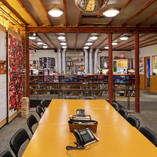
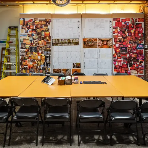
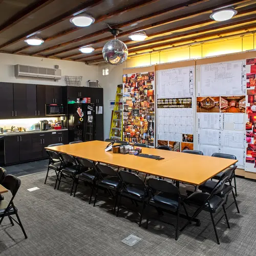
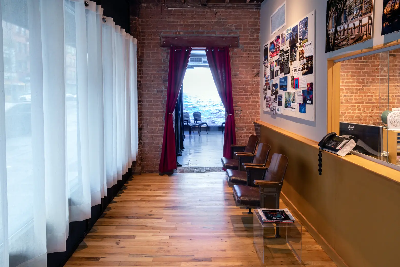
Then entryway and the adjacent conference room
Can you tell us a bit about your backgrounds?
Brett: My background is actually in theatrical design. I went to Carnegie Melon and then moved to New York literally thinking I was going to start assisting on and off Broadway. My first call was from my professor at Carnegie Melon saying, “I have this friend named Paul Gregory who’s got an architectural [firm].” I had heard of Focus and had seen Paul’s work at the Entel Tower in one of the theater magazines. I was like “Okay, it’ll be interesting.” I thought I was signing up for six weeks of graphing. That’s the story. I landed here and never left, which is actually how it works for a lot of people.
Christine: I think a lot of us have a similar story. I went to NYU. I studied lighting and set design at Tisch School of the Arts there. I was doing little shows around town, downtown theater. I had a friend who worked here as a project manager. We were doing off-Broadway shows together. She was doing it in her spare time. She kept saying, “Come up to Focus. Talk to us. You’ll love it. It’s great.” I kind of felt like, “What do I know about architecture? I’m a theater designer.” Then I came here and started getting involved in the work. It was a really interesting transition to go from temporary productions to architecture with a different feeling of permanence to it. I think a lot of us take our theatrically trained approach and apply it to architectural spaces in a unique way, which is something interesting we’re able to bring to clients.

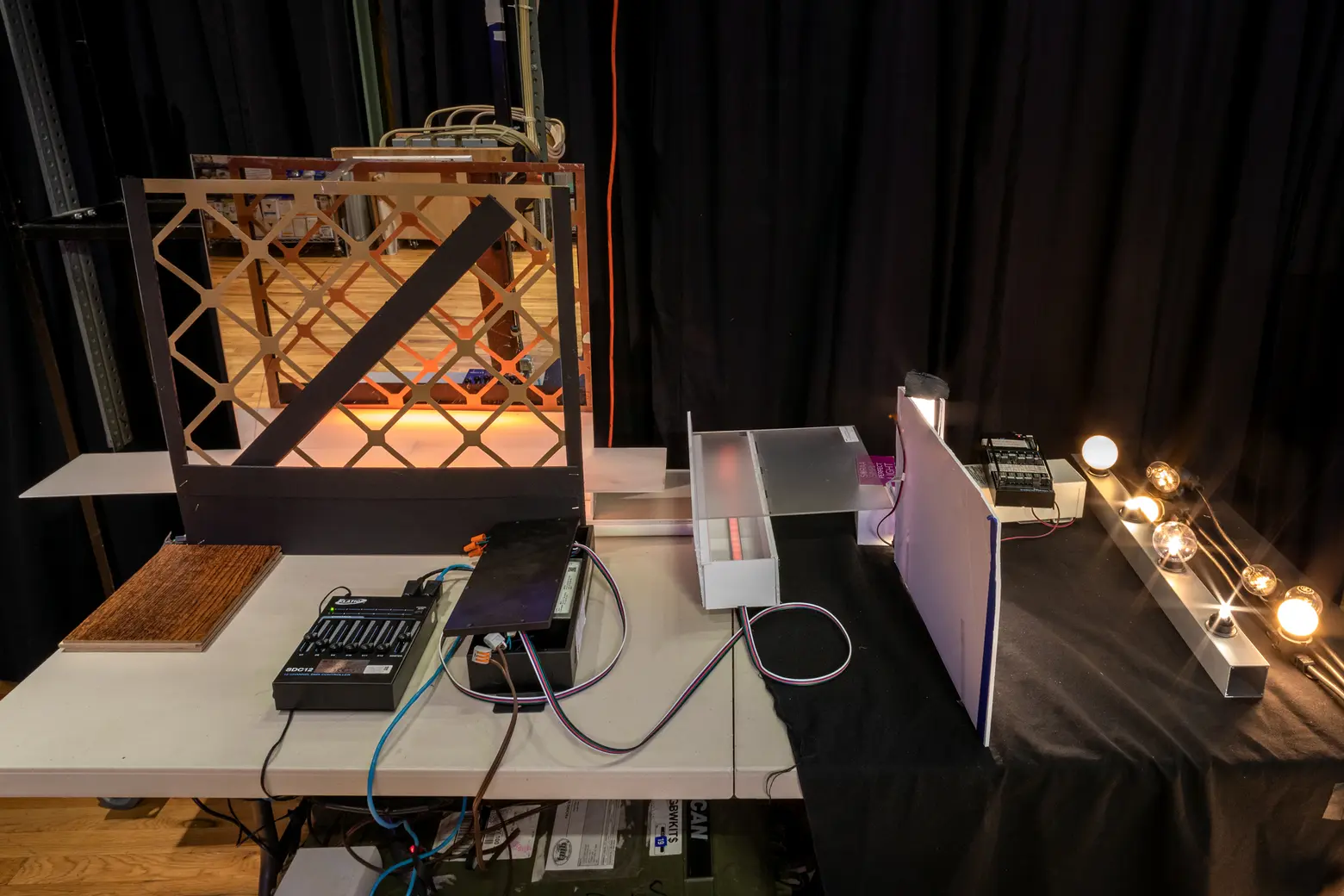
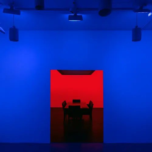
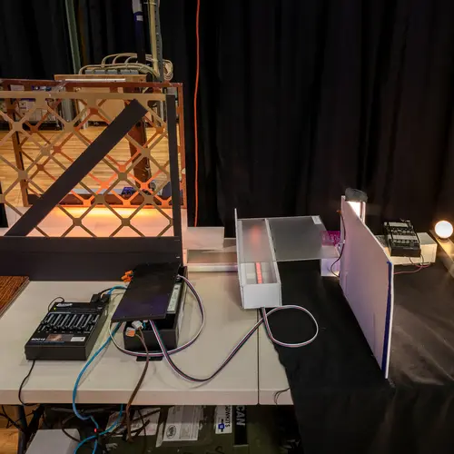
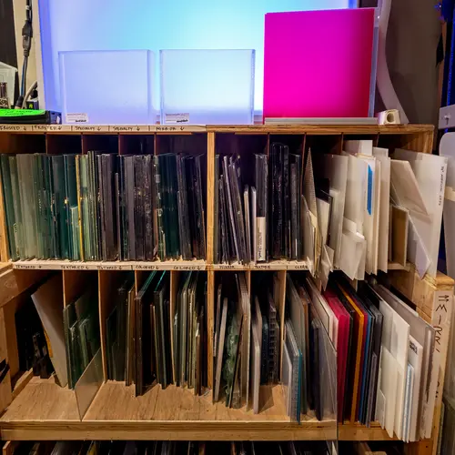
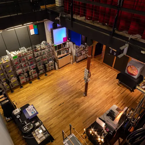
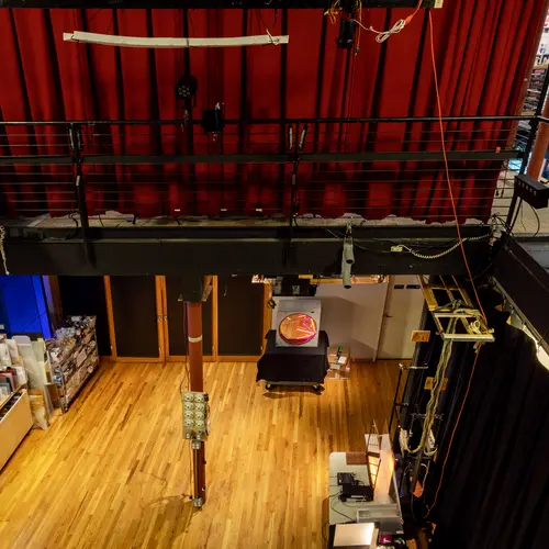
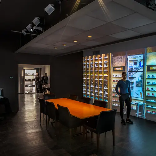
Behind the conference room is the Light Lab. Though most firms only use rendering software, Focus uses this flexible space to mount architectural elements, looks at glass samples, test lighting, and more.
As someone not in the business, it’s interesting to learn how a theatrical background is such a great fit for this type of work.
Brett: We used to sit in a dark theatre as lighting designers and try to figure out where we want the audience to look onstage, where the action is? We’re constantly thinking like that with every project that we design. You walk into a restaurant. Where do you want your guests to look for the very first time Hopefully, you can use light combined with the interior design and the architecture to stir an emotion in someone.
Paul Gregory, who founded the company, also came from theater and then from manufacturing. We also have trained architects who work for us, as well as interior designers and people who went to school for architectural lighting design.
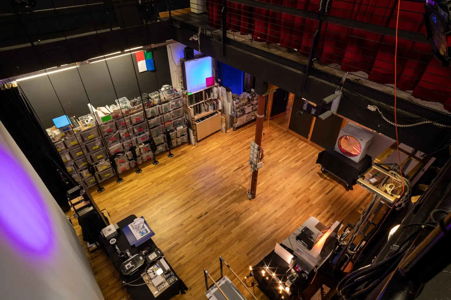
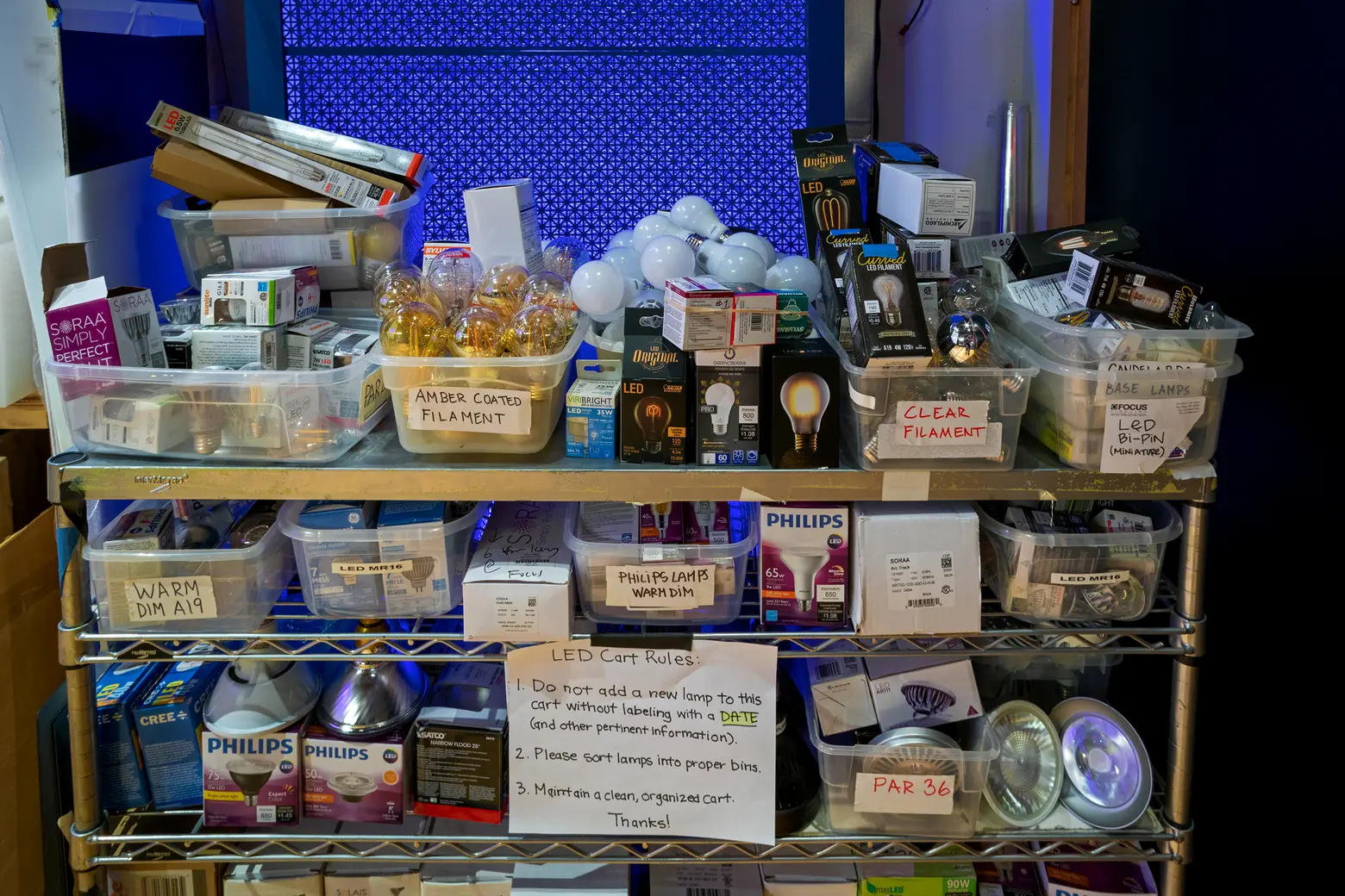
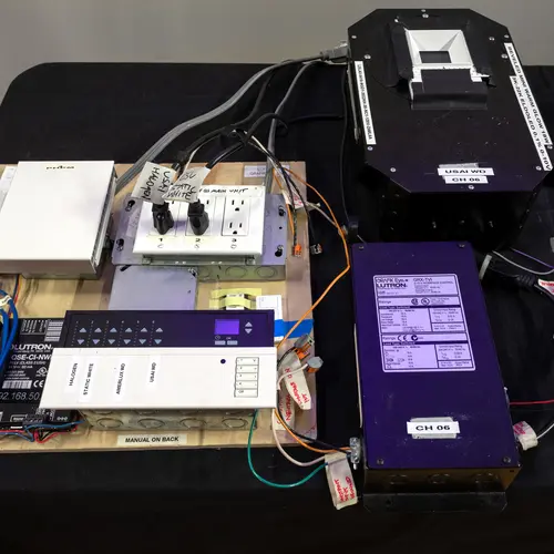
The Light Lab has three different dimming systems.
Brett, you’ve been with Focus for 22 years, and Christine you 18. What are the biggest ways the firm has changed over that time?
Brett: When I started, we had about eight people, and were largely focused on restaurants and hotels with some retail and high-end residential mixed in. Now, we’ve almost quadrupled in size and have expanded into museums, public parks, large exteriors, and more.
I think we reached a point where some of the younger designers wanted to start expanding the portfolio not just in terms of the project types but also the range of architects and interior design offices that we were working with. We started working with Shop Architects. We work a lot of big firms like Gensler and SOM, but we also really enjoy working with the younger boutique firms. I think that’s a big change that’s happened.
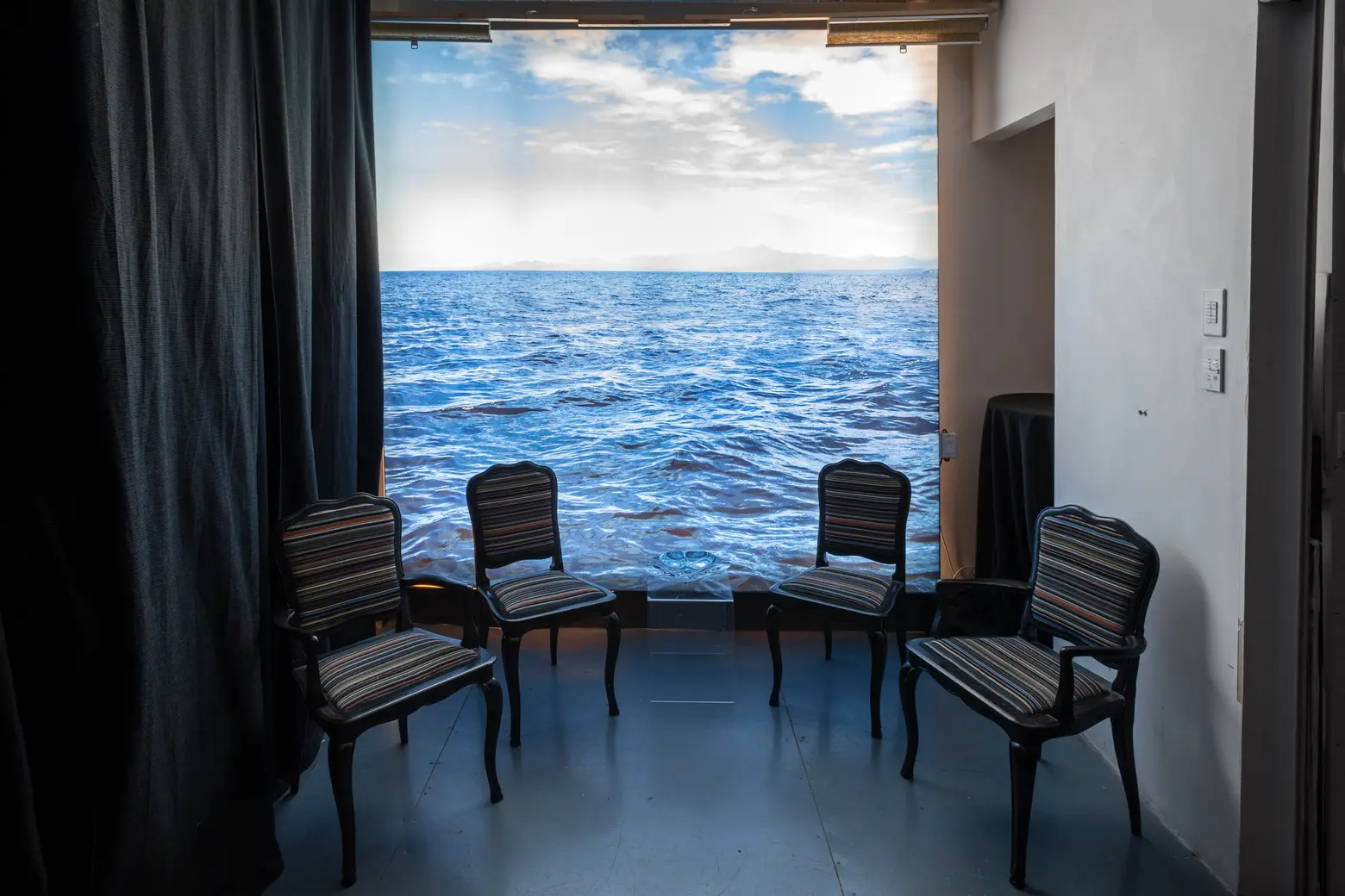
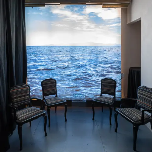
On the other side of the ground floor are the immersive Gallery rooms. This ocean graphic is made up of a 2′ x 2′ LED panel behind a printed graphic–it only cost $50.
What about how the lighting industry has changed?
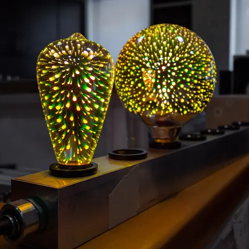
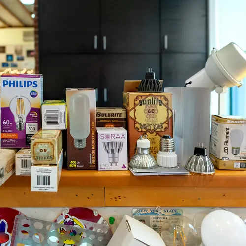
Brett: The lighting industry has totally been turned upside-down since around the year 2000. This was the year we did our first project with NLEDs on it. That was what’s now the Regal Theatre on 42nd Street near 8th Avenue. It used to be a Lowes Theatre. Around 2010, that’s when the white LED started being used for architectural lighting. The lighting section at Home Depot went from being about 10 feet wide to 50 feet wide. Everyone and their brother were selling white LEDs that would last forever. That’s the world we’ve been living.
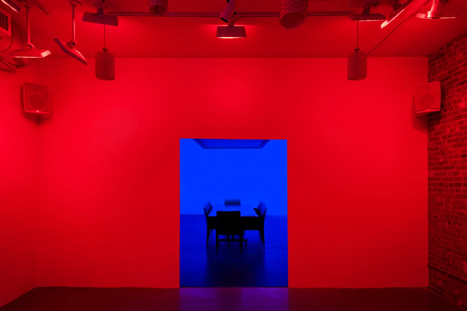
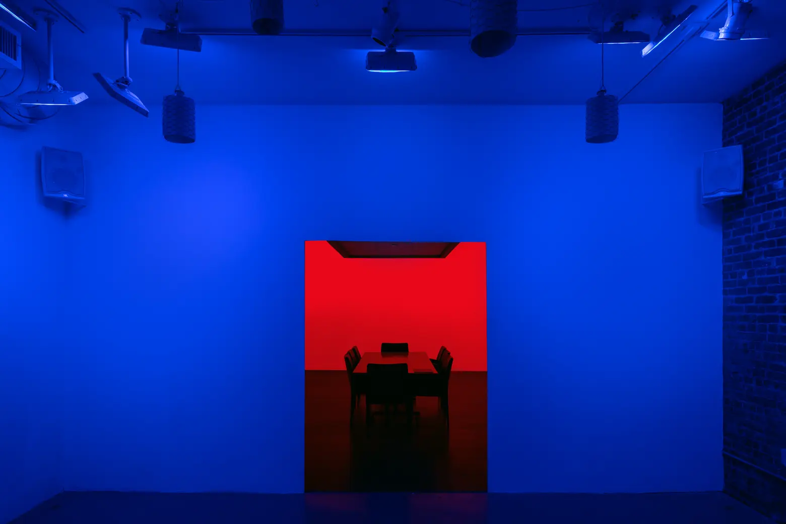
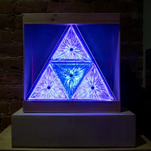
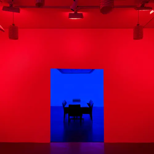
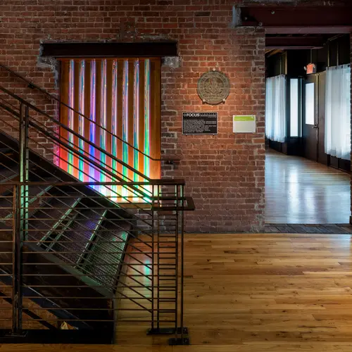
Some of Focus’ studies can be likened to the artist James Turrell.
Do you think the general public now pays more attention to lighting?
Brett: It’s interesting how much more aware the public is of the little details when it comes to lighting. I have family members who now understand what color temperature is for light and how cool or warm they want their spaces to feel. It used to just be incandescent. Now people are much more attuned to the difference between different light qualities which makes interaction with our clients actually great because they actually understand what we’re saying. They appreciate it.
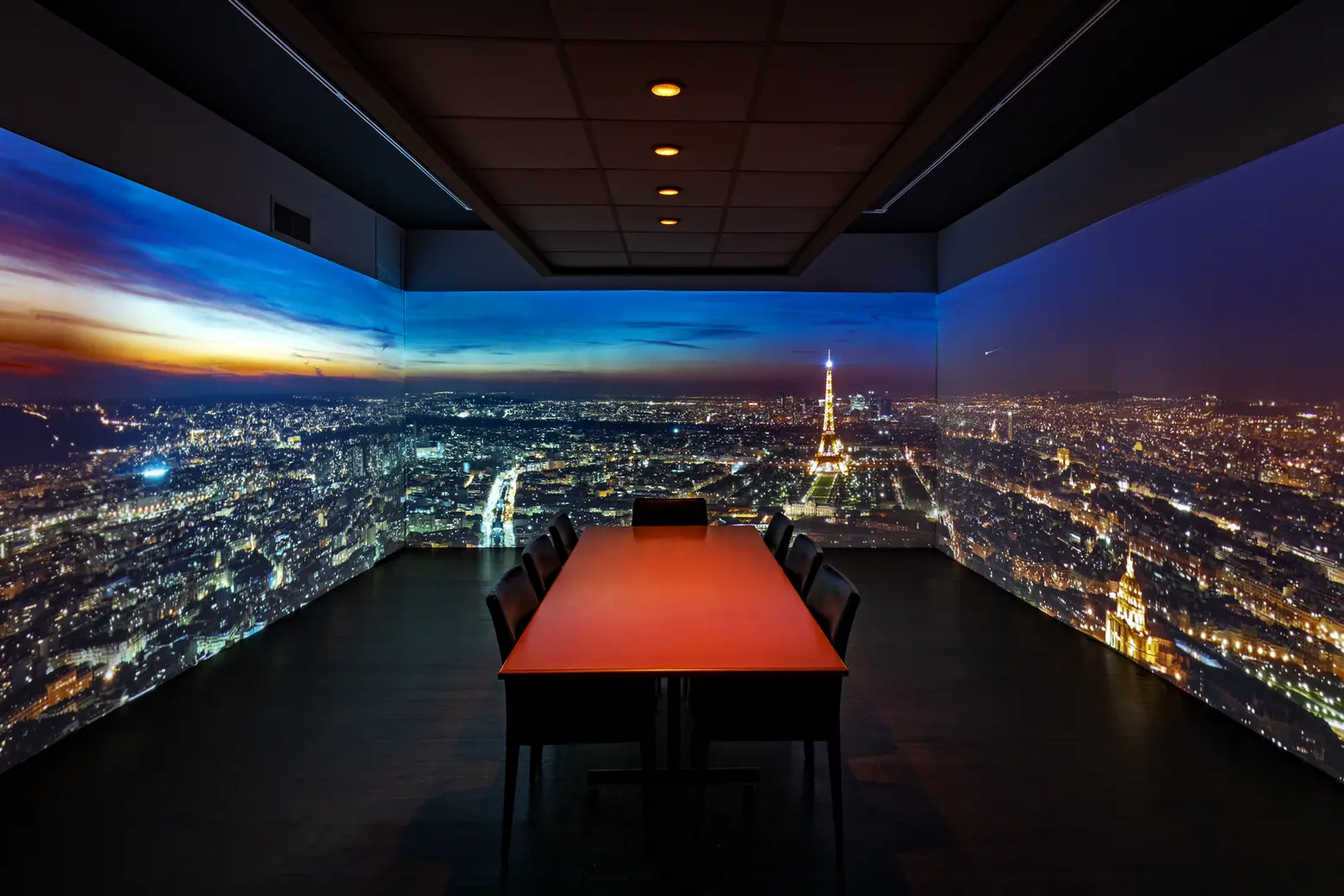
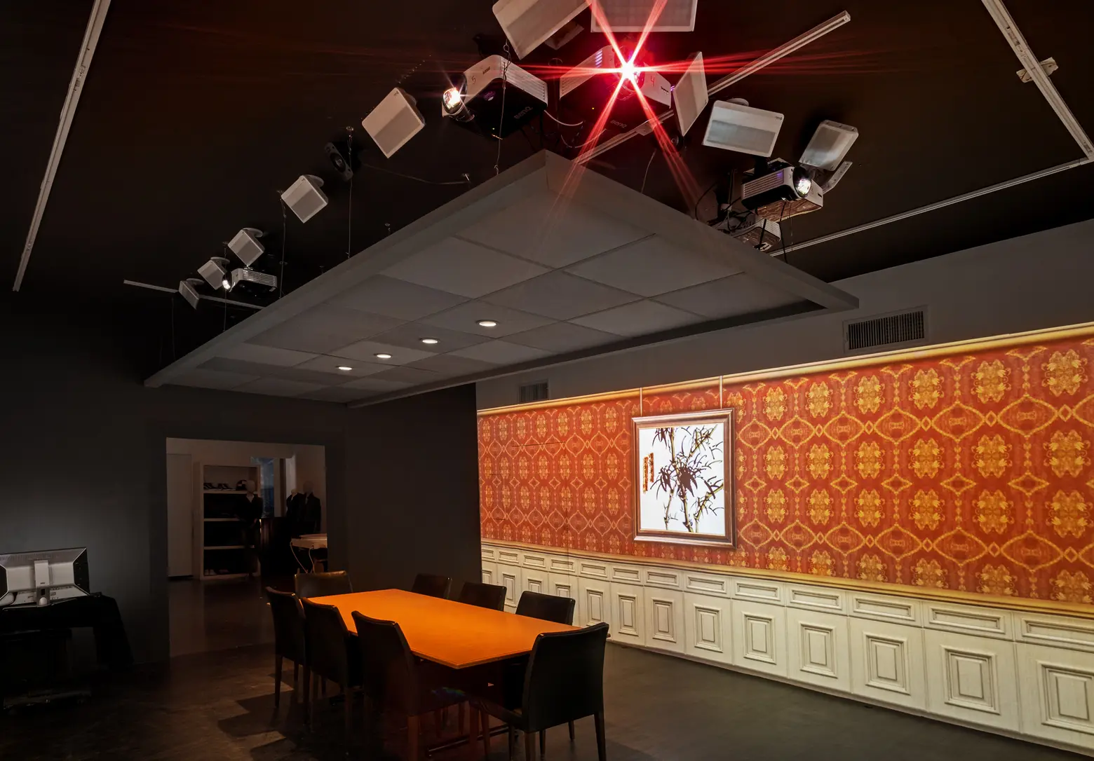
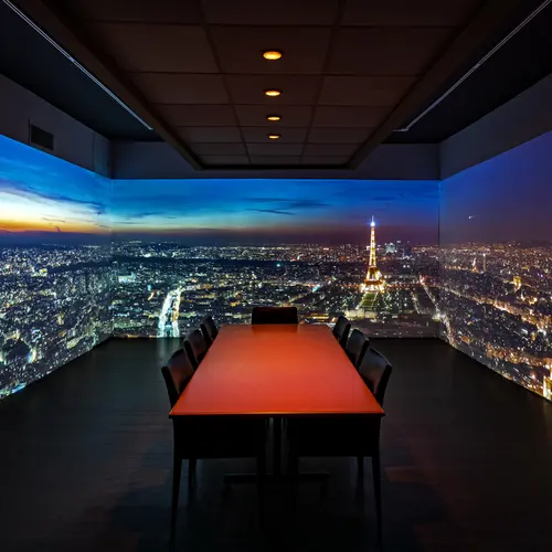
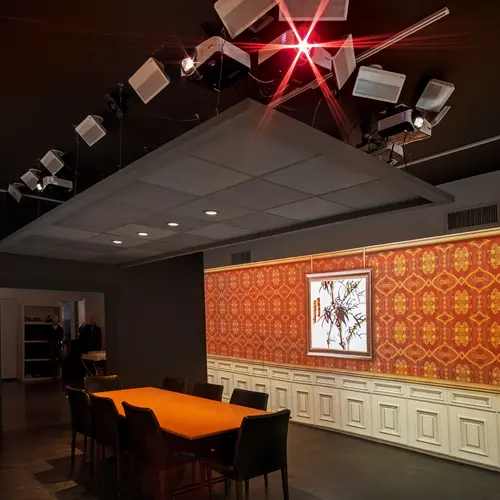
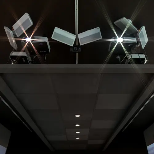
Through a series of six wide-angle HD projects on the ceiling, this gallery space can be transformed into different “rooms.”
Was there one project in the past that really put Focus on the map?
Brett: I mentioned Entel Tower. It was an exterior, which was a different type of project than Focus had been doing, and the first time anyone had ever used automated color-changing lights on a building.
Christine: I think Toys R Us in Times Square, the flagship at Toys R Us, that was a big deal when that opened. It was a huge store in the middle of Times Square with a Ferris Wheel in the middle of it and lines around the block. I just feel like that set a new standard for what a flagship store for your brand should be. That was an exciting one to be a part of.
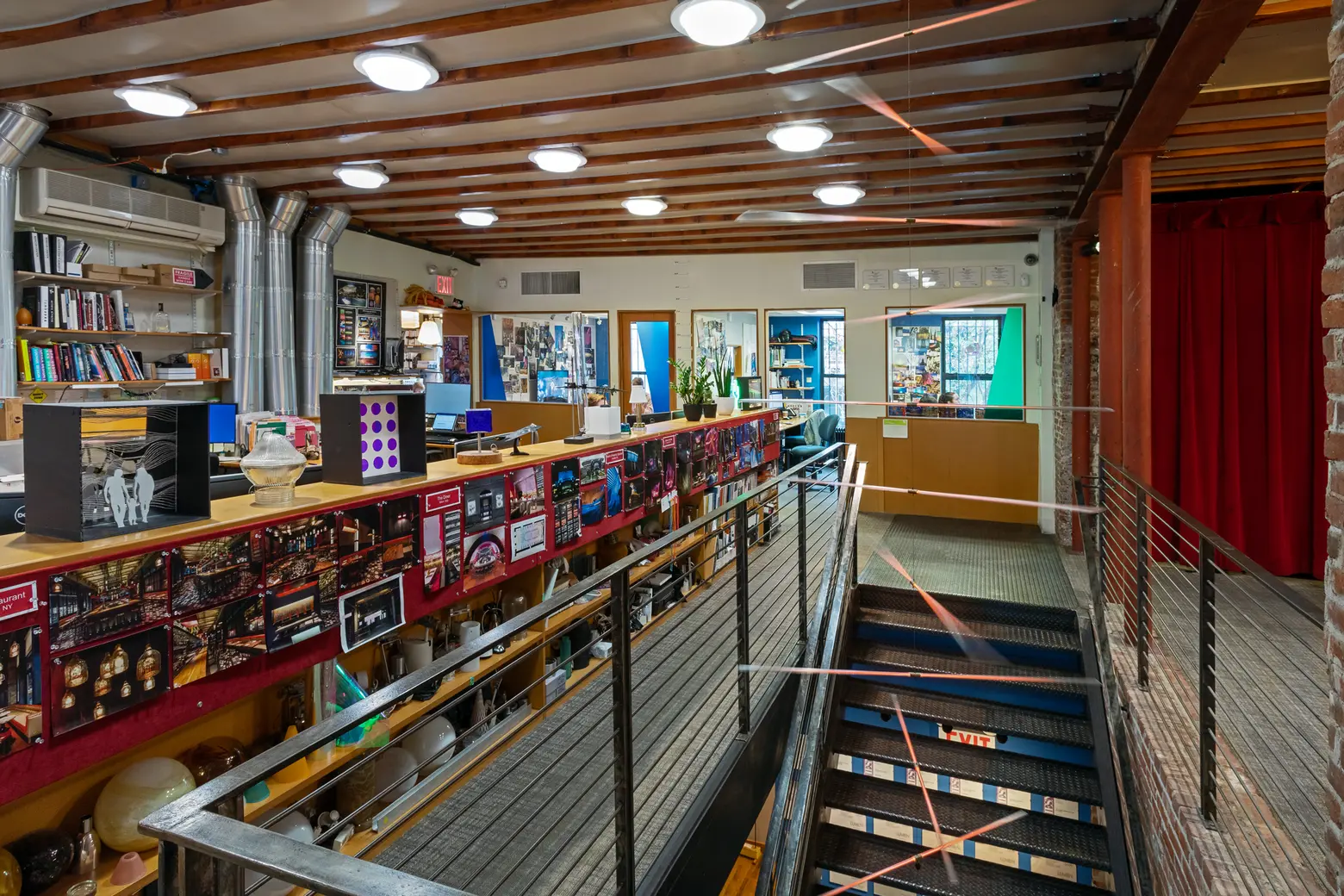
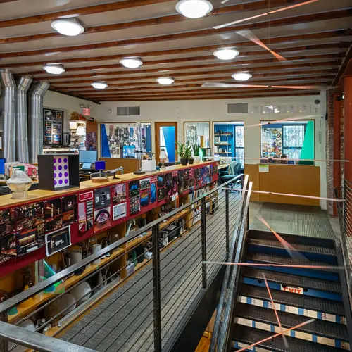
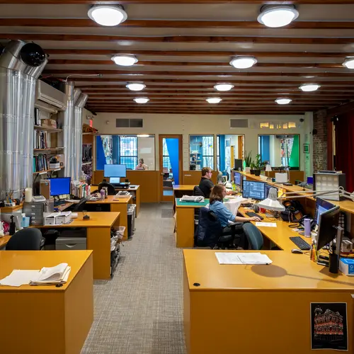
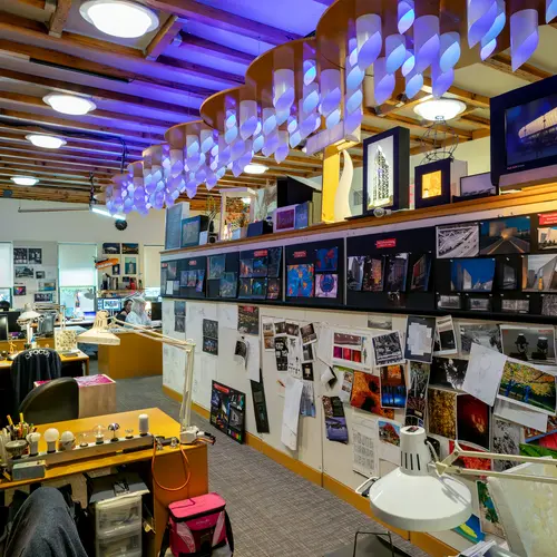
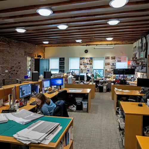
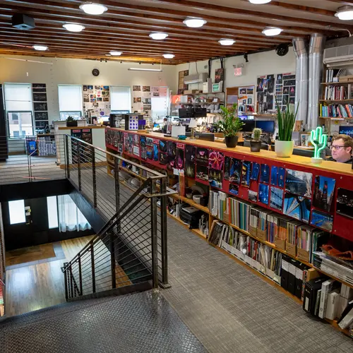
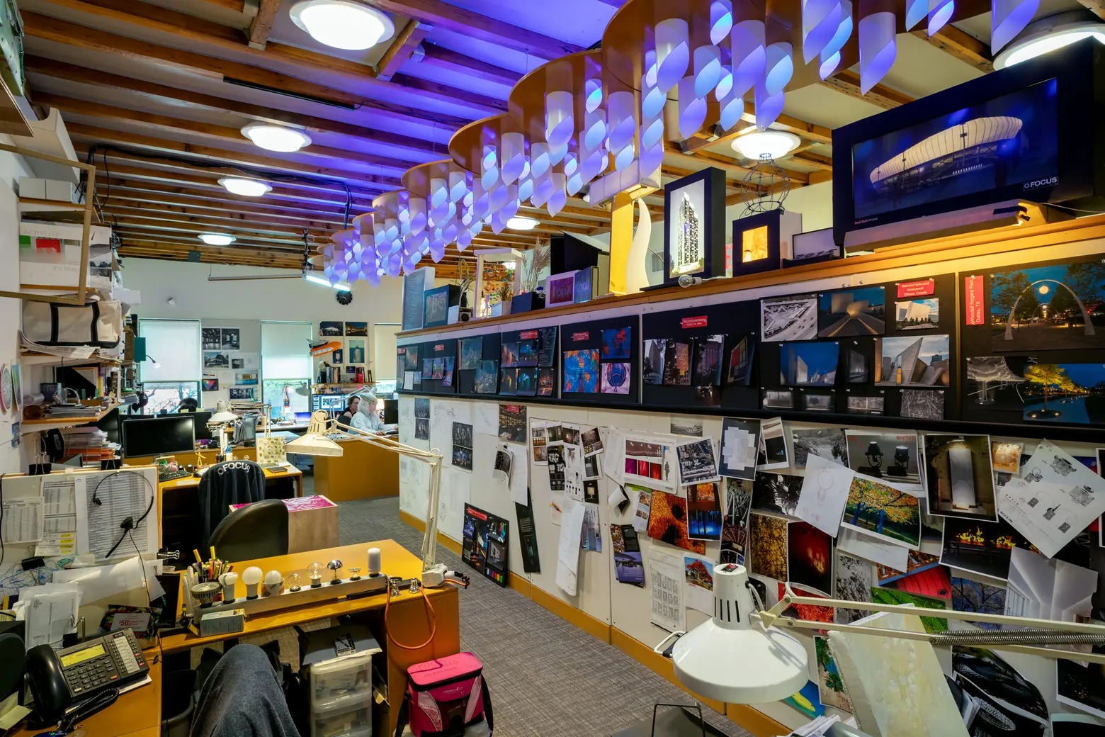
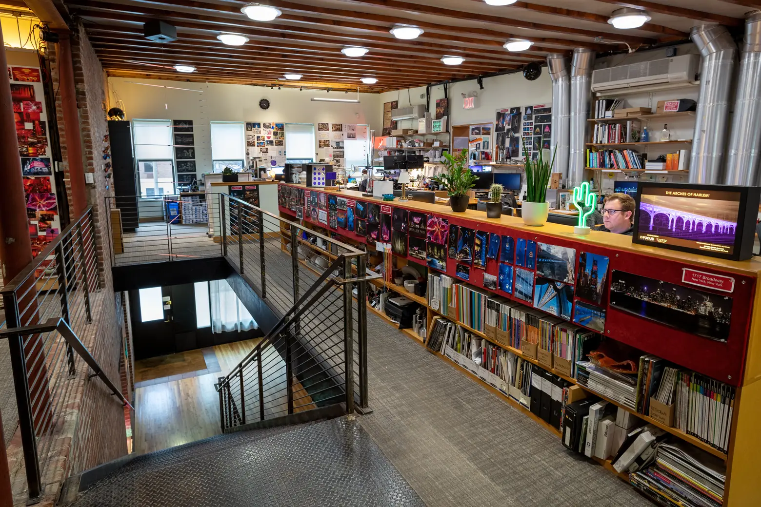
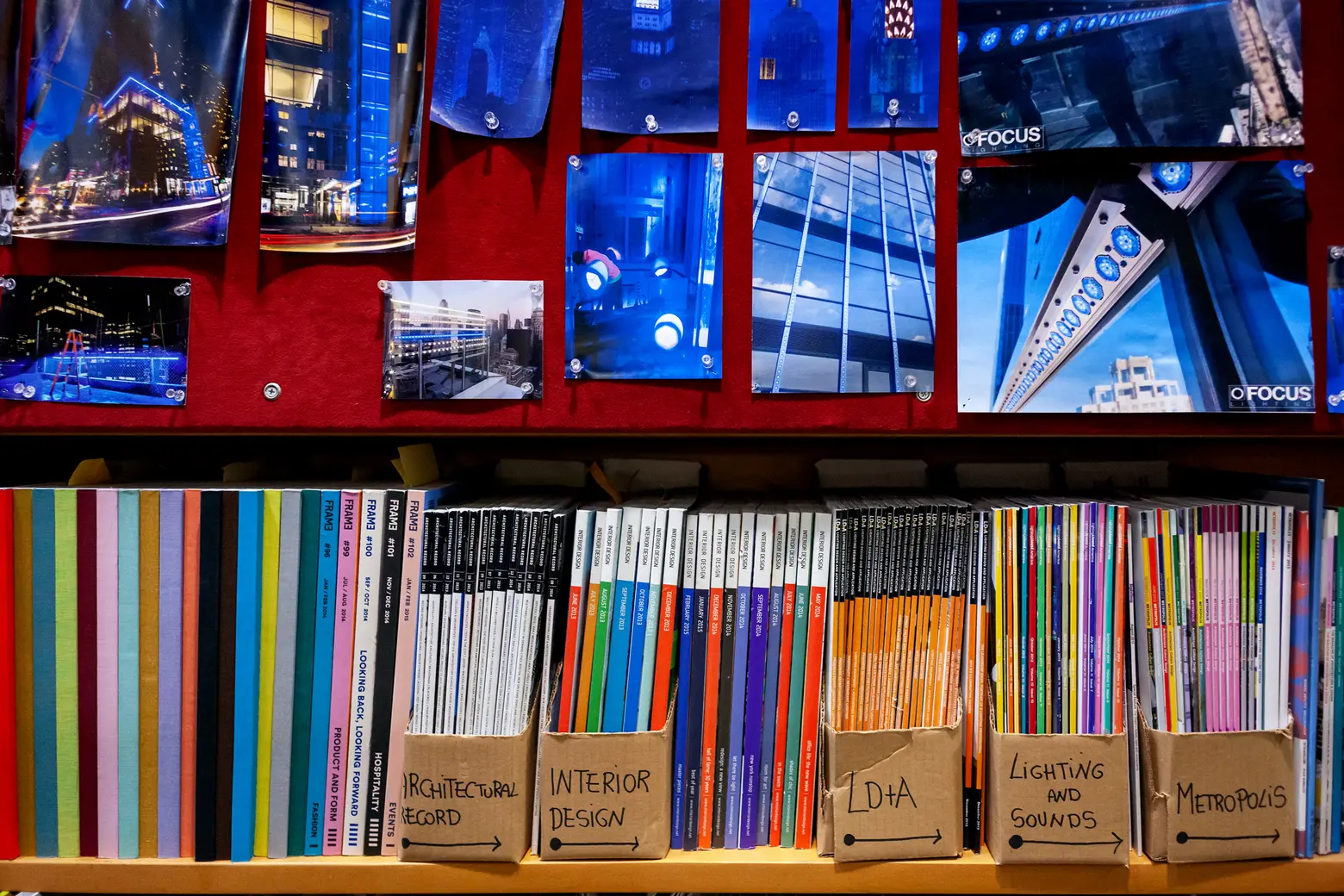 The second floor is all the office space.
What’s it like to start working for Focus?
Brett: We very much intentionally hire people who want to be lighting designers. We really don’t hire draft smiths and renderers. It’s very different – we’re basically training people from the moment they come in to eventually be a senior designer or a principal. In fact, we have a one-year long training program that’s very structured. We know what someone’s going to do on day one, what they’re going to learn on week one, month one, etc.
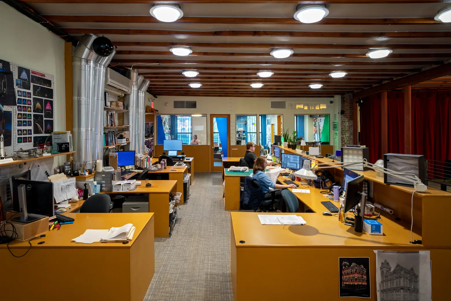
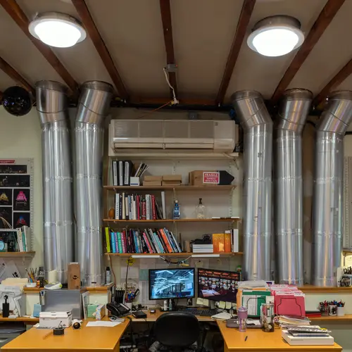
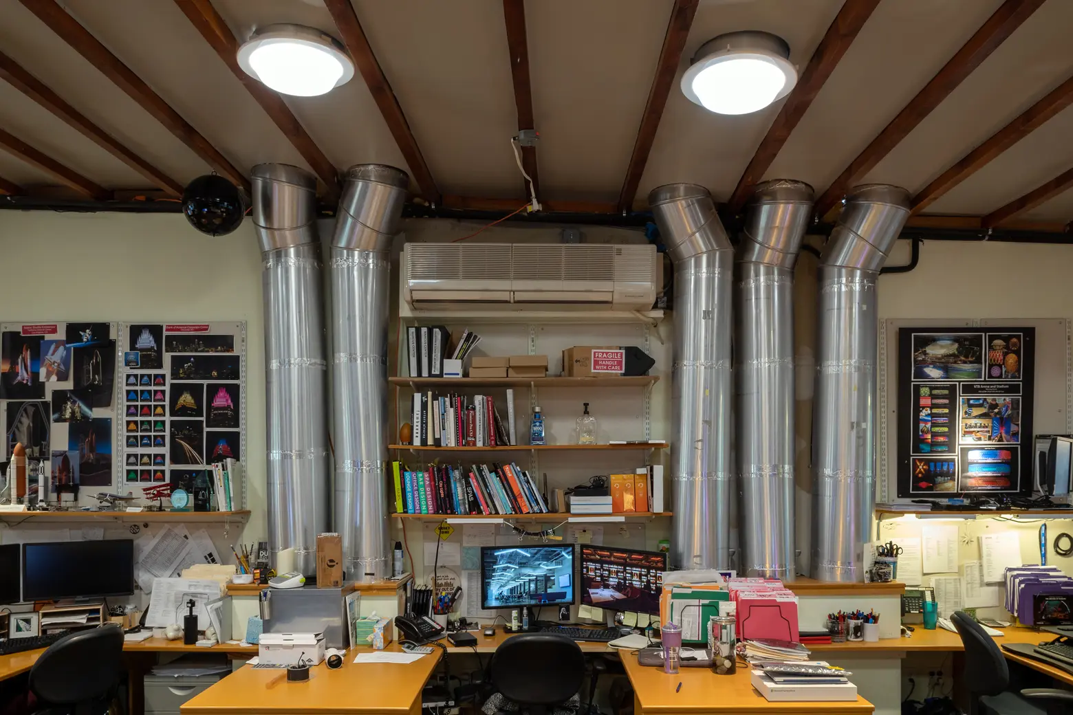 To bring light into the large, open space, Focus added five Solatubes when designing the office. These tubes then take light down into 44 skylights.
How is the office organized?
Christine: There are five different studios. Every studio does a good mix of different project types. We try not to pigeon-hole anyone to doing a certain kind of thing. It’s that idea of always having something new and different to work on. You’re constantly flexing your creative muscles on these different project types and not getting bored doing the same thing over and over again. Each studio is comprised of one lead designer or senior designer and then a group of other project designers and junior designers who work with that person on a set of projects. Each studio has 10 to 20 projects on its list at different phases of design and construction.
Brett: The only studio that actually breaks from that mold is our high-end residential studio. It was sort of a struggle to switch back and forth between a commercial project and then switch your mindset to that residential world.
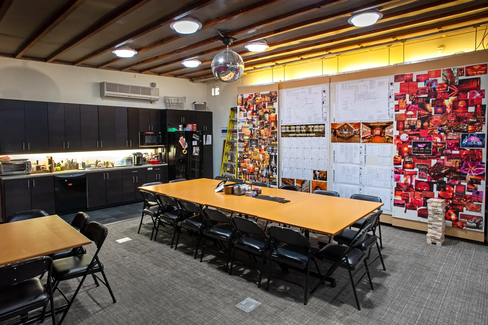
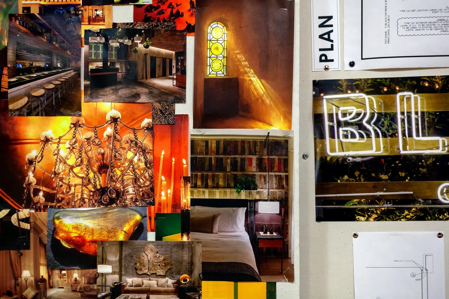
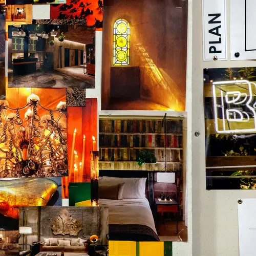
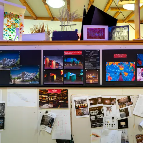
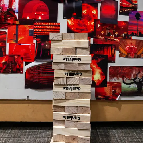
The kitchen also features a huge mood board for project planning.
Speaking of, what types of residential projects do Focus work on?
Brett: When we work with developers on large, residential buildings, we often do the lobby where people get that first impression.
Christine: We also do some more amenity spaces and sometimes the apartments, too.
From your experience, how would you say a developer or property owner decides to bring in lighting architects specifically versus just relying on the regular architecture?
Christine: I think a lot of that probably comes through the architect. They understand the level of design that they’re going for or the style of the space they’re going for and feel that they need a lighting consultant to partner with them to help bring that space to life.
Do you think that translates to the hospitality and retail projects as well?
Christine: In a restaurant, it’s similar, but I think there you have owners who are a little bit more savvy about how lighting affects the feeling. They’re looking more for a lighting specialist to really create that mood that they’re going for.
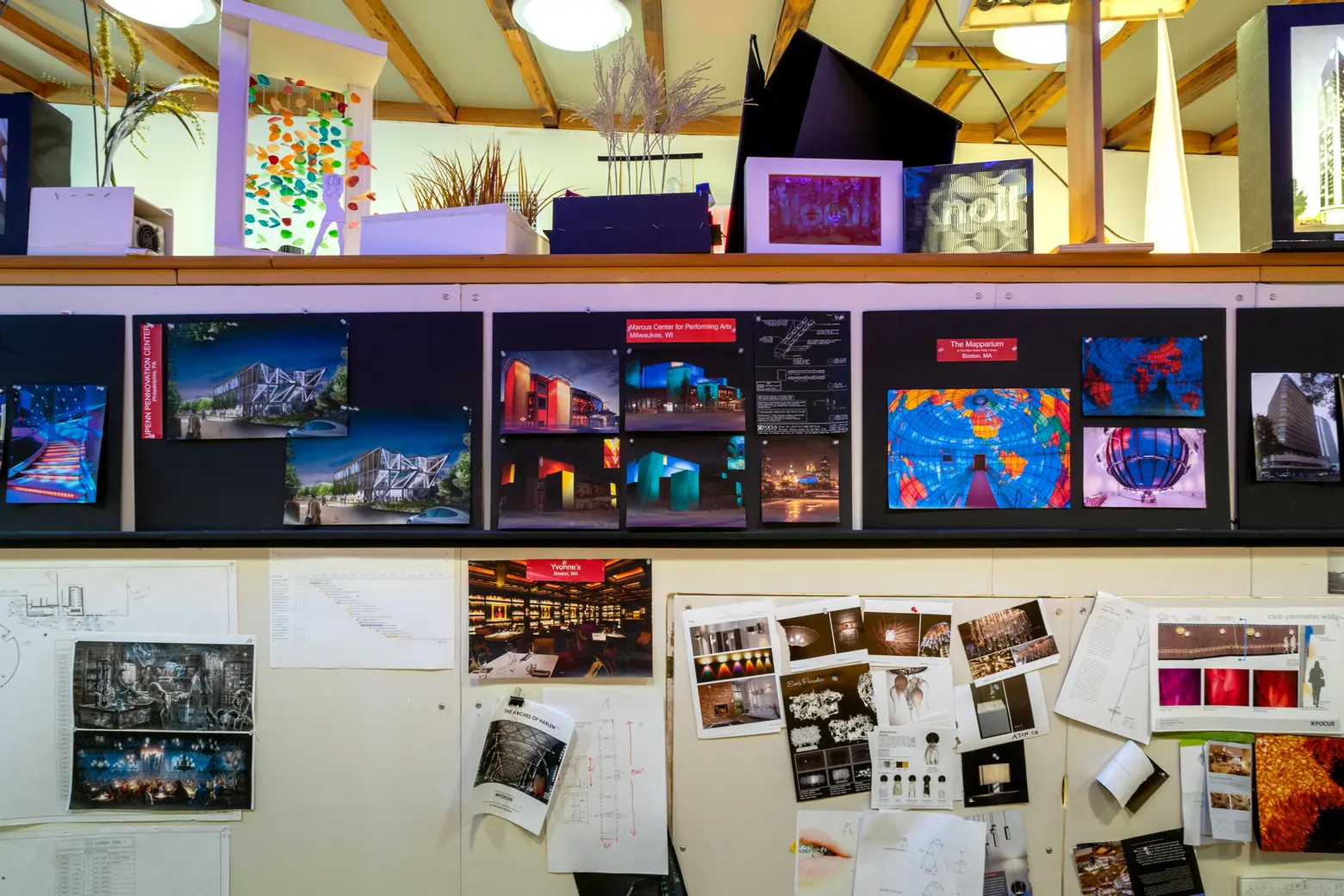
Do you work collaboratively with the other designers on a project?
Brett: That’s central to how we work. When they don’t, it’s not as much fun, frankly. We don’t feel the outcome is as good. When we get brought onto a project and have our first meeting with the interior designers, we’re asking questions that are not really about lighting. We’re asking questions like, “What feeling are you trying to create? What are you or the owner’s goals? Are we trying to transport the guests to another experience that’s not in a restaurant in New York City?”
What about when it came to designing your own offices… what was that like?
Brett: We had an architect and engineers and obviously contractors, but we were very involved in providing the interior design, especially the space planning and how big of spaces we needed. How are they in relation to one another? Who sits next to who? It forced us to think in a completely different way about how we work than what we were doing at the old office.
When you moved from the original office at 101st and Broadway, did you know you wanted to stay in Harlem?
Brett: Yes. Paul lives [in the neighborhood]. There was a draw for that. We looked at places downtown, but we couldn’t do what we’re doing here downtown. To get 9,000 square feet just wasn’t a feasible thing, especially with the double-height space. For a 35-person firm, it just wasn’t financially feasible. This seemed to be perfect on all fronts.
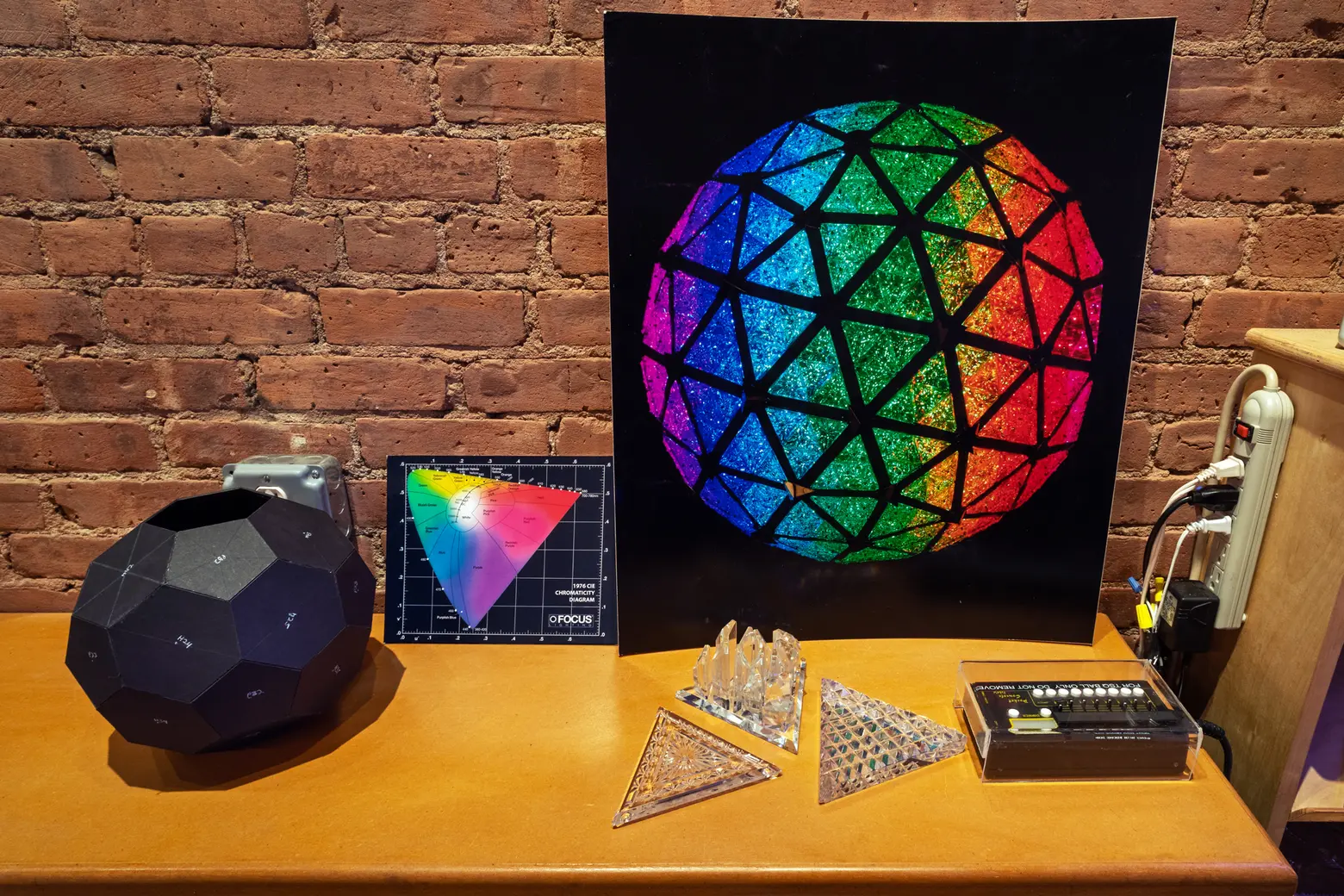
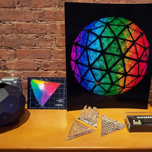
Different study components of the Times Square Ball.
What was it like working on the Times Square Ball?
Christine: [The first year we worked on it] was New Year’s Eve 2007 turning into 2008. It was the 100th anniversary. We redesigned it. Waterford [provides] all these beautiful crystals every year and it’s tied into the Macy’s branding for all of the ornaments they sell. With the lighting of the ball, it was just a core of colored light bulbs in the center. You couldn’t see any detail of the crystal. That was the challenge they brought to us, “How do we make this crystal really feel like crystal that sparkles?” We knew we needed to get more dimensionality on the ball.
Brett: We analyzed how people experience the Times Square ball; you basically have three audiences. We all watch it on TV. It looks like the ball is about 50 feet away, but you’ve got the people in Times Square, 50 stories, 500 feet away. If you’re lucky enough to get to the top of One Times Square, you’re right there. You’re five feet away. You have to make it look good from all three [vantage points].
Christine: We found that one of the keys was how light refracts with the crystal. You have to get the cutting on the back side of it because that’s really what’s catching the light. Then we had them back-cut it. But this messes up the pattern that they’re trying to sell. We did it front and back, so together it makes the pattern. Then we created mirrored chambers inside to create these really nicely-defined patterns.
The show starts at 6:00 PM. The ball is raised. Then every hour, there’s a unique show that plays. Each one has a name and a concept and a story. Then at midnight, there’s obviously the midnight show. It does six different shows each New Year’s Eve.
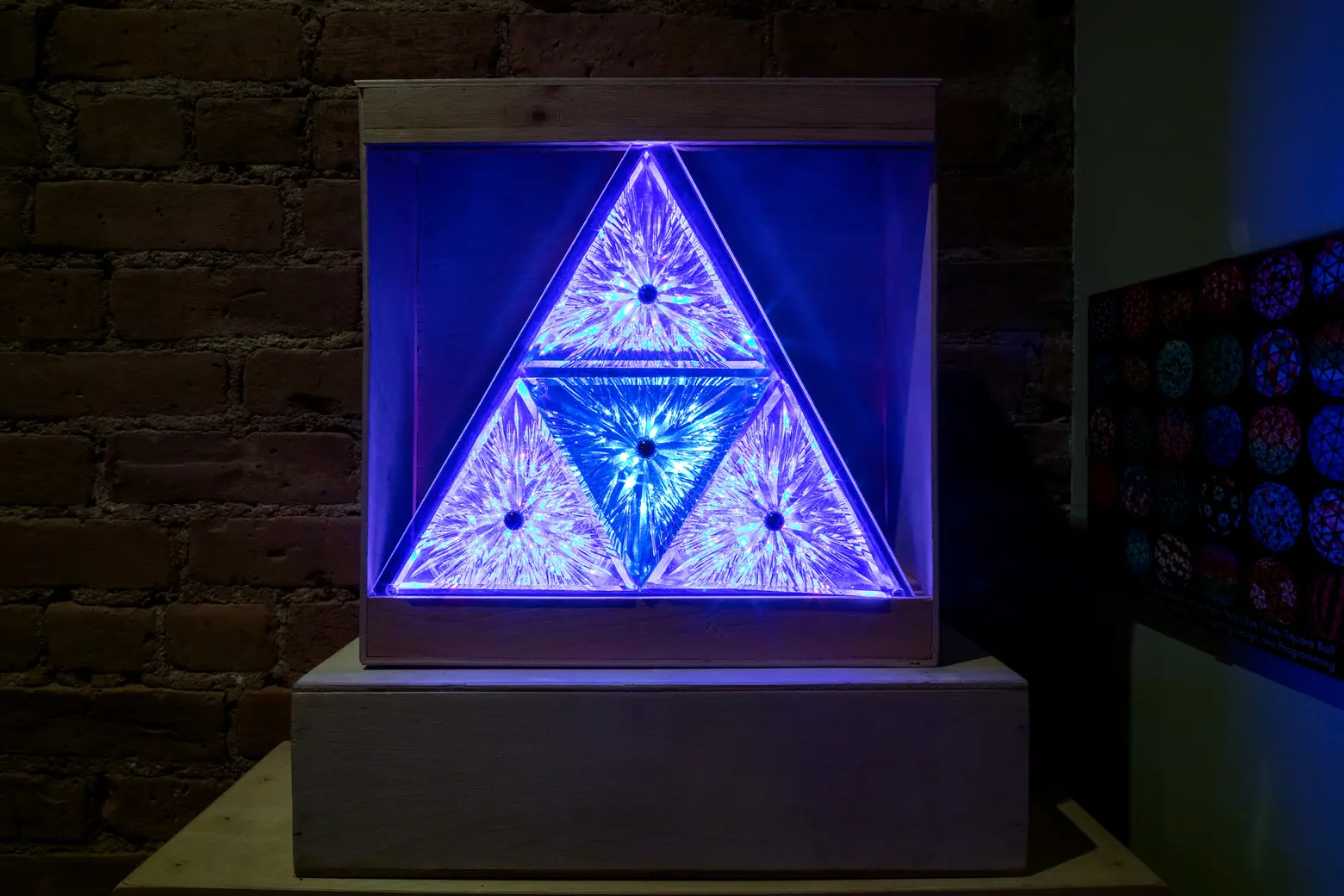
The final design!
It must have been amazing to see it up there in Times Square for the first time.
Christine: It’s very exciting to go from being in school for theater design and then feeling like we’ve got the biggest show on Broadway ever in the history of the world. [That first year,] we went the day before, checked everything, triple checked everything. I still feel a little bit nervous every year at about 11:58 PM. I’m like, “Oh, god. Please, work.”
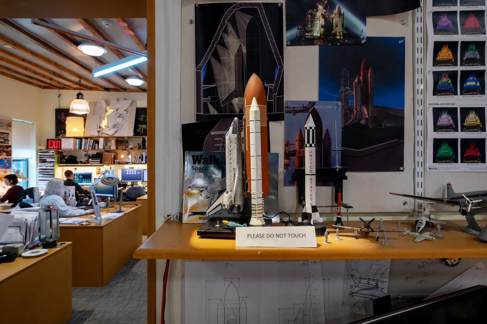
Would you say that’s your proudest moment to-date?
Christine: Yes, maybe that project or maybe Tavern on the Green. That’s such an iconic place. There’s so much history. To be involved in the renovation of that project really felt like an honor.
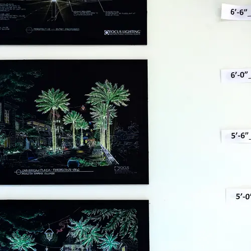
If you remember the old Tavern on the Green, it was all these huge trees just wrapped in Christmas lights. It was that iconic image that everyone can picture from old New York. When we redid it, they had to rip out all those trees because they were dead from having been wrapped in lights for 30 years. We really challenged ourselves and said, “How can we create this idea of nature wrapped in light and create this sparkling, opulent feel that people associate with Tavern on the Green when we don’t have any of the stuff that they used to have?” We created this string light canopy over the courtyard, using tall poles and a tensioned aircraft cable system so we didn’t have to have a center pole and make it feel like a circus tent. It was just this canopy of light hovering over the courtyard There are 500 tiny, crystal chandeliers hovering over the courtyard.
Brett: If I think about the project I was most proud of, it’s a park in Dallas called Klyde Warren Park. There’s a highway called Will Rogers Freeway that cuts through [city]. It actually goes subterranean and literally breaks apart two neighborhoods. So [the city] decided they were going to deck over the highway to create this land out of nothing.
[When we first visited,] we were there at 10:00 PM at night and the place was empty. People did not hang out in this area of town. Then, I was giving a talk in Dallas three years after it opened. It just so happened they took us to a restaurant right up against the park. First of all, there were no restaurants anywhere near there. That was a complete change. We’re sitting in the restaurant and looking out. It’s like 9:00 PM at night and the park is packed like families, little kids playing in the lit fountains. The fact that we lit this park in a way that can be enjoyed at night just completely transformed these two very separate and different neighborhoods. Lighting can make a big difference in people’s lives. It’s a simple one, but there you go. The place just becomes a gathering space for thousands of people every week.
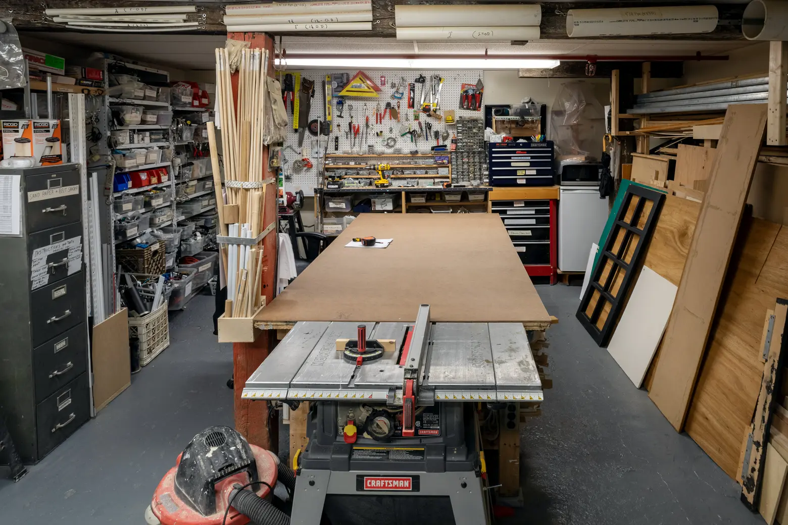
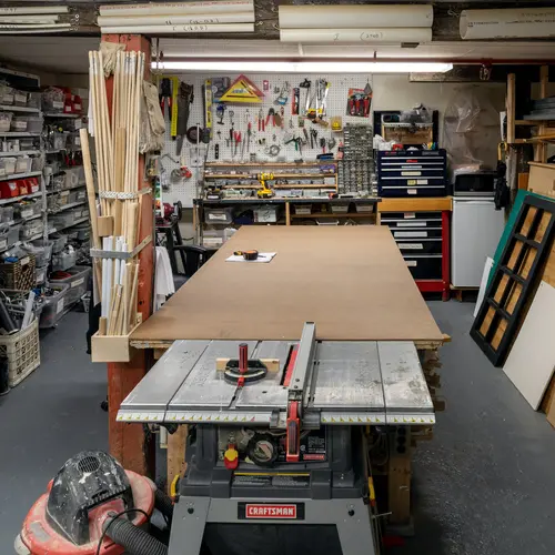
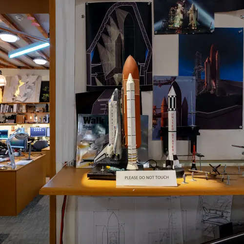
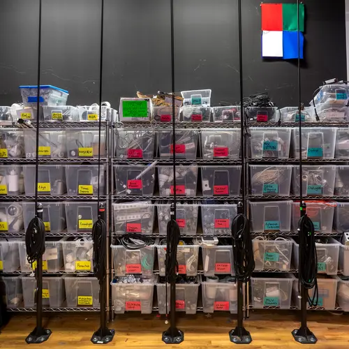
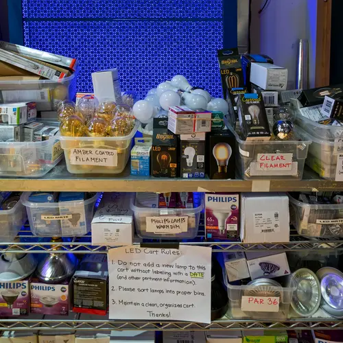
The workshop is located in the basement.
Is there one very exciting project you’re working on now?
Brett: We’re doing the new design for the Waldorf Astoria now. There are actually two projects there. The original hotel is being split into a hotel and a multi-unit residential portion. We’re designing all the rooms, all the historic lobbies, and all of the amenity spaces for the hotel.
All photos taken by James and Karla Murray exclusively for 6sqft. Photos are not to be reproduced without written permission from 6sqft.
