How NYC companies use workplace design and perks to affect emotional health and productivity
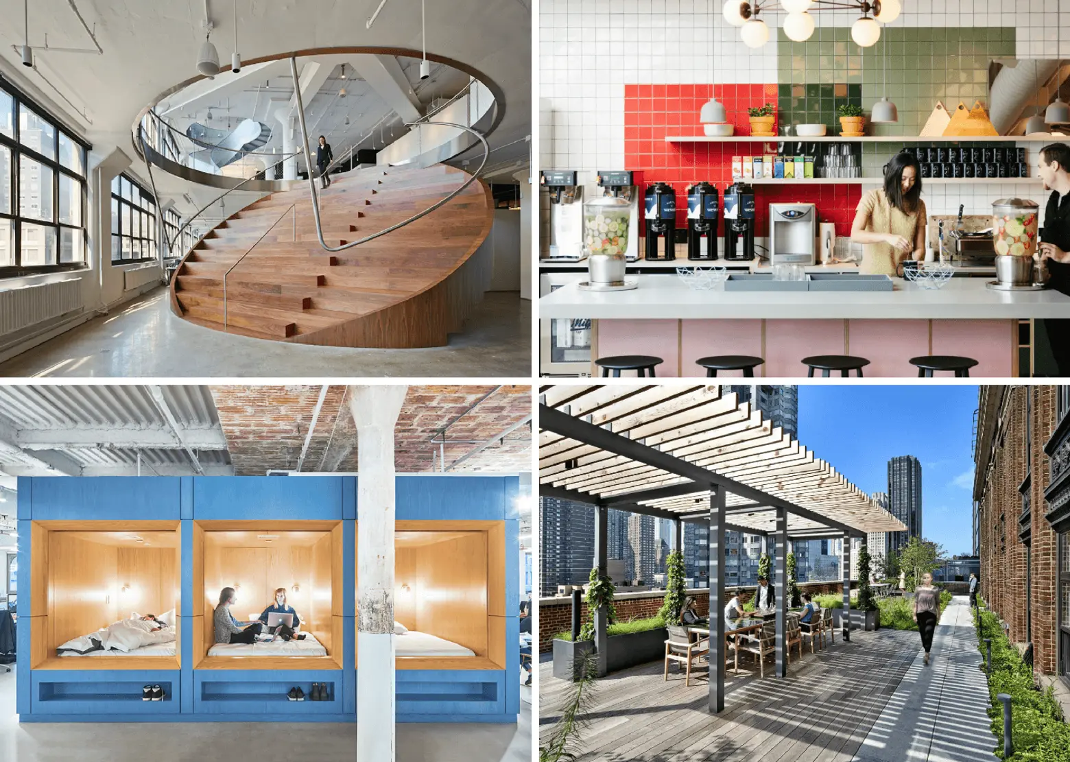
Modern companies understand that in order to attract and retain the best talent, they have to compete on more than salaries, vacation, and healthcare. Companies like Google, WeWork, Pixar, and Facebook are well known for providing workspaces that inspire creativity, collaboration, and innovation. Clive Wilkinson, the architect of Google’s Silicon Valley headquarters, is quoted as saying, “75 to 80 percent of America is cubicle land. Cubicles are the worst – like chicken farming. They are humiliating, disenfranchising and isolating. So many American corporations still have them.” Modern office designs are the opposite of closed off, fluorescent-lit cubicles- they are open with natural light and little, if any, suggestion of hierarchies.
In addition to designing workspaces that inspire creativity, these modern companies also providing perks like free food, drink, and recreation to entice employees. So what are some of the best practices in designing offices for people’s emotional health and productivity? And what other perks do companies have to offer to attract the top talent?
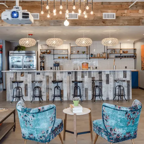
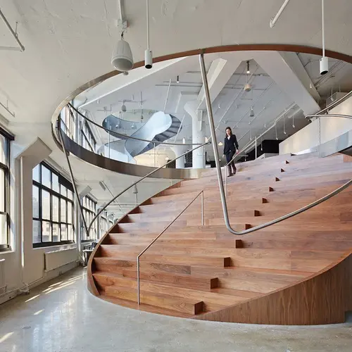
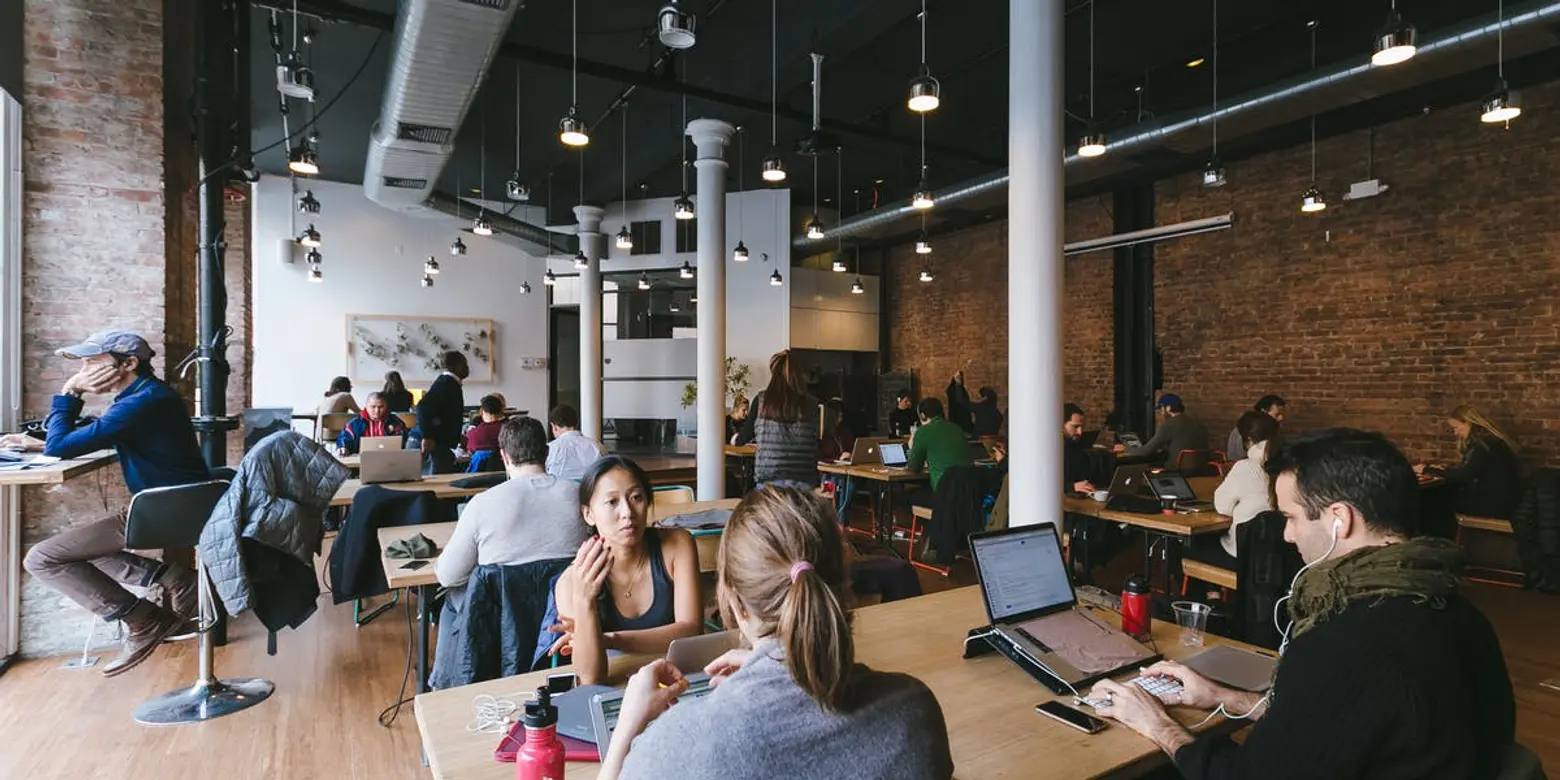 WeWork’s Soho office, courtesy of WeWork
Designing for success
In an Atlantic magazine article, Nikil Saval, author of “Cubed: A Secret History of the Workplace,” states, “that space in an office often reflects the way power operates in a workplace: design expresses (though not in a simple way) relationships of hierarchy, control, and authority.” He goes on to explain that, ironically, the cubicle was initially intended “to free office workers from uninspired, even domineering workplace settings…the original cubicle was about liberation.” Clearly, today the cubicle is seen as the antithesis of freedom and is thought to dull an employee’s experience by cutting off views and interaction with others.
Breaking down traditional notions of how offices should look and function, many companies are making spaces that are more comfortable and flexible with movable furniture, lots of natural light, childlike play experiences and designs that inspire.
Christa Tilley, Creative Producer at Glossier, reinforced this by saying working in Glossier’s open, airy and light-filled offices makes her feel healthier every day. She also believes the open plan fosters a very different kind of workflow. “In the closed door office I used to work in, I didn’t know who was in charge of things and where to find people. Now, we all sit together on comfortable couches that feel like we’re in a home and we’re really able to get down to it.”
In a speech to the American Institute of Architects, the late Barbara Stewart, a San Francisco-based architect and trained Feng Shui practitioner, said that humans are able to cope with short bursts of stress but modern life provides a constant low level of stress which is hugely taxing on our immune system. She believed design can combat this by replicating nature because, as Stewart explained, “Humans feel most comfortable in spaces that follow nature, instead of monochromatic bubbles.” She said spaces should replicate nature- the floor should be dark like a path (which is why so many people like hardwood floor), eye-level colors should be neutral and the ceiling should be light like the sky.
A ground-breaking 1984 study demonstrated that biophilic design, which is based on the similar assumption that humans have a deep, innate connection and love of nature, helps expedite healing in hospital. Giving patients access to light, sped up recovery time after surgery.
In 2006, COOKFOX architects Rick Cook and Bob Fox, along with environmental strategist Bill Browning, founded Terrapin Bright Green to consult to organizations about biophilic design and “new approaches to address the critical needs for a sustainable future.”
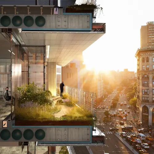
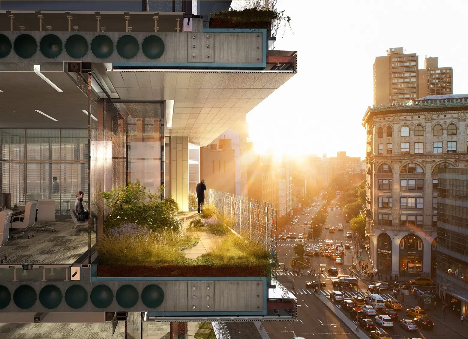 300 Lafayette © COOKFOX Architects
COOKFOX’s current project, 300 Lafayette, a boutique office building in Soho, is a great example of making an office space as functional and pleasurable to be in as possible. Architect Brandon Specketer explains, “When we design an office building, the building must be a representation of the way we want our workspaces to be designed in the 21st century. We designed 300 Lafayette to attract and retain the best type of employee.” He continues, “We wanted to make sure these ideas of biophilia are not just an overlay on the building but really about how it gets hard-coded into the design of the building so you meet those unspoken requirements people look for in spaces they are naturally attracted to.”
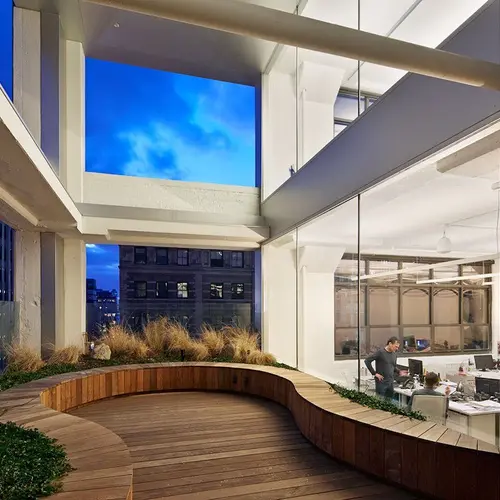
 A green roof at COOKFOX’s offices, courtesy of COOKFOX
No matter where you are in the building, you should have access to nature, whether through a view, a terrace or any access to outside. Some of the features COOKFOX considers is the tenant’s ability to control movement, air, light and temperature in addition to a real connection to nature, not only on the rooftop but on every floor of the building.
Specketer says that when designing office spaces, “just as we spend 40+ hours a week in the office, we consider what would we want out of what is essentially our second home. A big design factor always depends on the intended tenants of the building. When designing offices with computer-driven work, for example, “Google-like” companies, COOKFOX incorporates spaces that get people away from their desks and into “communal spaces where they can bump into one another.” We have designed “harvest tables and harvest kitchens to get people to not eat at their desks. But we don’t just put a table in and expect people to sit there. It is important to consider where you are putting that table, is there a view of a terrace or direct connection to nature and natural light?”
Christa Tilley points out that things like a beautifully designed office space and free perks can be really important to people in their 20s who are working really hard at their careers but haven’t gotten to the point that they are able to make their homes as nice as they want them to be. “When you’re in your 20s, you’re really roughing it. Coming to an enjoyable and aesthetically pleasing workspace encourages you to stay longer and work harder. It’s a taste of comfort and luxury that you don’t get in your day-to-day otherwise. And since it’s such a young workforce in the startup culture, these perks are really appreciated.”
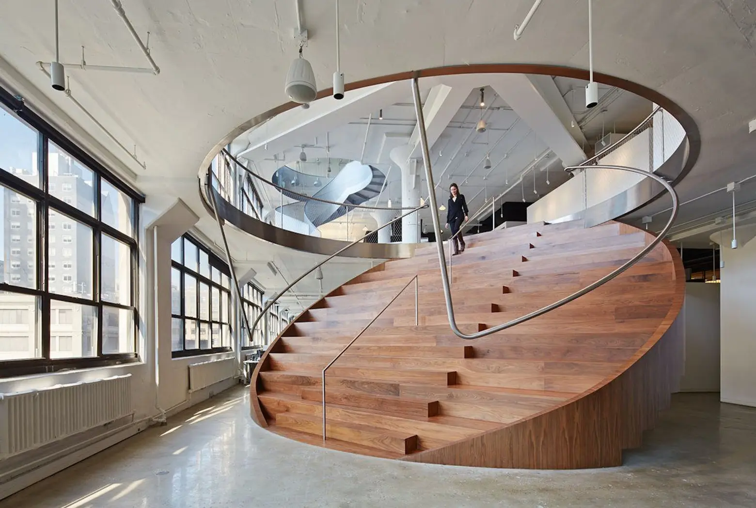
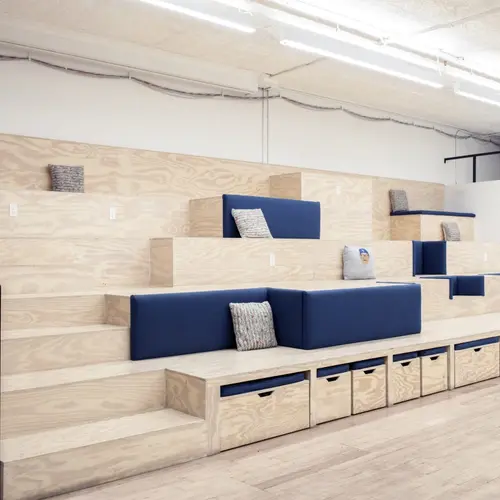
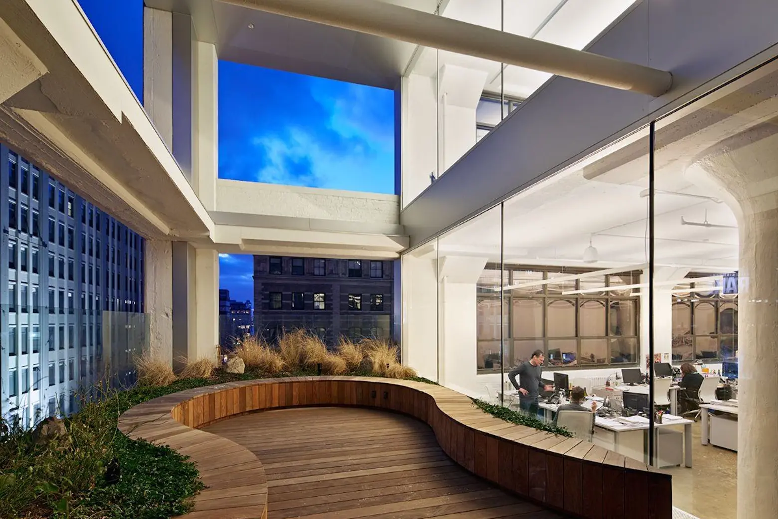 Wieden+Kennedy’s New York Office, courtesy of WORKac
Understanding the importance of informal discussions, advertising firm wieden+kennedy’s NYC office also focuses on creating unlimited opportunities through WORKac’s designed “discussion spaces” which range from stairs that can also be used as benches, counter meeting spaces, picnic table conference rooms, and a serpentine outdoor park bench.
In a report titled, “Physical Space and Social Interactions,” Jay L. Brand, PhD, outlined nine ways to make office spaces “foster interaction and improve communications.” Brand recommends well-lit rooms with many windows and high ceilings; friendly furniture arrangements that don’t give clues to hierarchy, like a circle of chairs versus a line of desks; couches versus chairs (only when people know each other well); and well-designed group areas since “60% of what people learn occurs informally.”
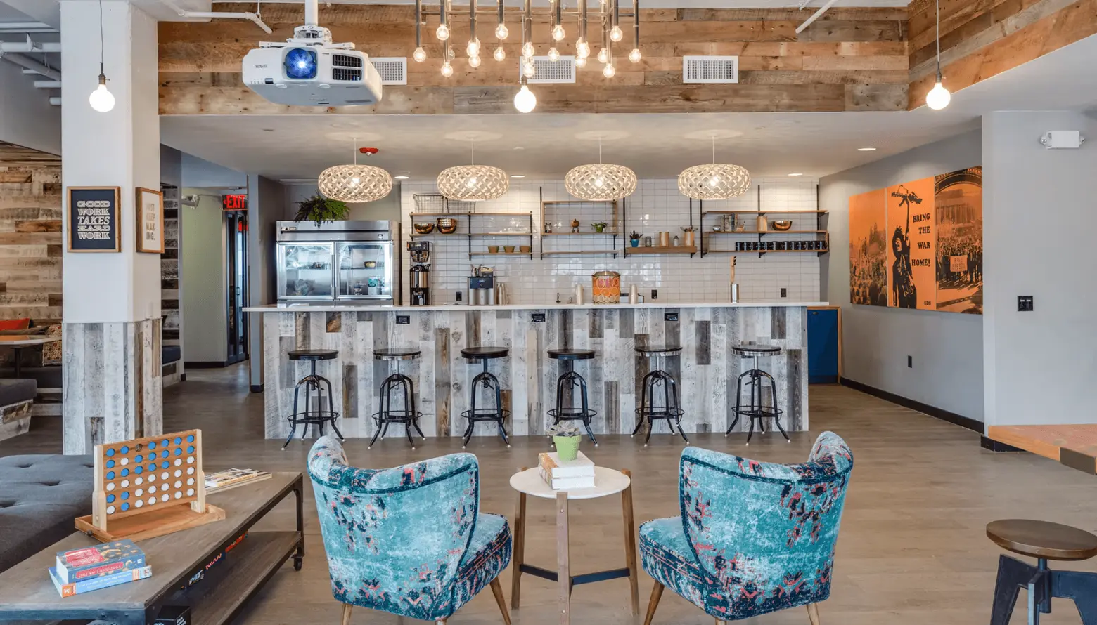 WeWork’s Berkeley offices, courtesy of WeWork
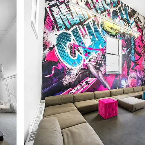
In a 2015 creator article, journalist Abraham Gross interviewed three WeWork designers about the “WeWork look,” illustrator and graphic designer Jeremiah Britton, and two interior decorators, Cindi Leung, and Kimberly Kolkovich. They design everything from where the walls will be to which pillow will go on which couch and each design is specific to the building and local culture (in Soho the WeWork office has exposed bricks and beams and in Berkeley, they designed carpets and tie-dyes on the walls).
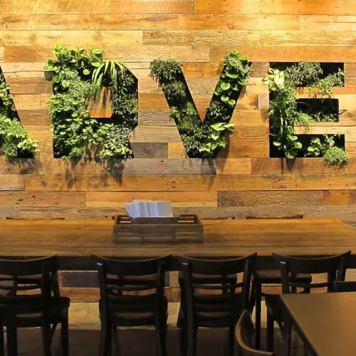
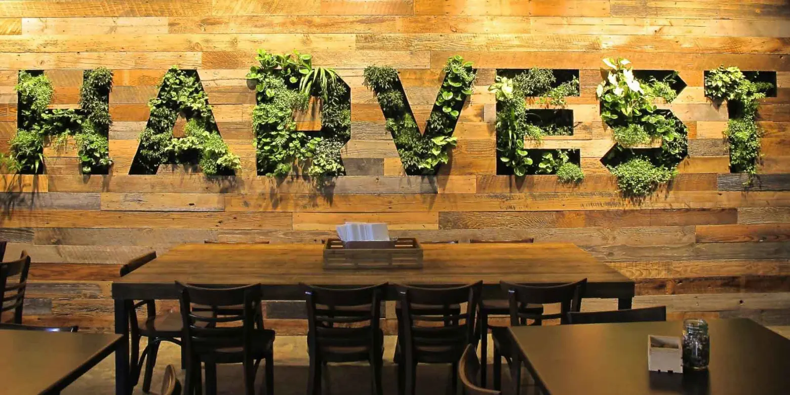 Facebook’s living wall, courtesy of Habitat Horticulture
Some of WeWork’s lessons learned are building interconnecting stairways to create closer connections between floors, moving lounges to areas with more natural light versus putting them in the center of the building where they had traditionally been, and placing plants everywhere, they’re “mandatory for designers. A great example of this is Facebook’s (very appropriate) Menlo Park living “wall.”
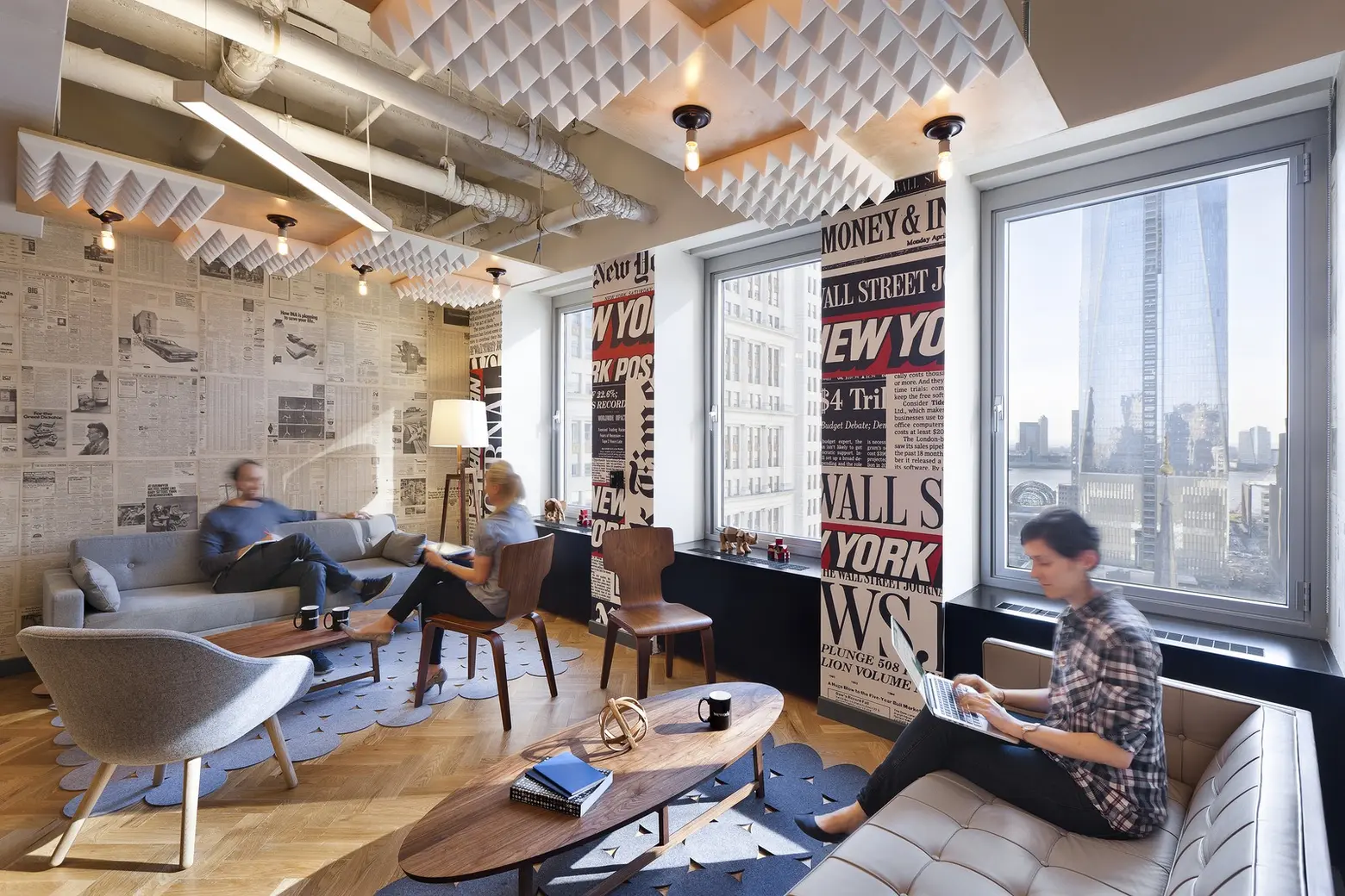 WeWork’s Fulton Center location, courtesy of VOA
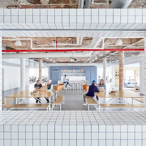
VOA, which designed the New York City and Washington, DC WeWork offices, explains, “The core mission of WeWork is to create a collaborative community where entrepreneurs and small businesses can interact and exchange ideas. Supporting this goal, the design program includes glass-front offices and benching desking accompanied by community areas including soft seating, conference rooms, lounges, game areas, coffee bars and pantries, and beer carts. Simple finishes and furniture offer a neutral backdrop for each occupant to personalize their space. These private spaces are offset by distinct, eclectic and playful community areas with mood lighting, bright colors, and distressed wood flooring.”
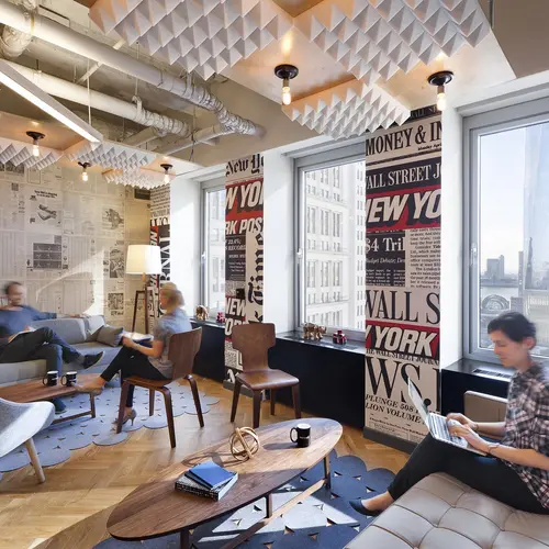
 Spotify’s NYC offices, courtesy of Fox Architects
Designed by Fox Architects, Spotify’s New York City offices have similar design aesthetics. According to the firm’s site, “One of the main goals was to create a space that attracts and retains young talent while drawing parallels to the design features from their Stockholm headquarters.” To do this, Fox Architects created “touch down” areas with plush couches and coffee tables, accent walls with artists’ interpretations of music, concrete walls, and a Kalwall (skylight) system.”
Dezeen quoted Ken Giannini, Interior Design Director of Scott Brownrigg (designers of Google’s London headquarters) as saying, “It is little wonder that Google is one of the most desirable places to work in the UK. We have enjoyed every minute of this exciting project. All the Google staff are up for innovation, brilliant ideas and they like to be challenged. We also recognize that Google is a serious business and demands efficiency, value, and solutions that can support their business practices. This project has it all – a fun working environment that also incorporates lots of practical solutions.”
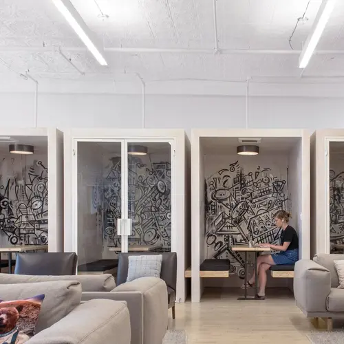
While everyone loves fun, sometimes a quiet spaces are necessary to get work done. Christa Tilley reinforces that by saying despite loving her office’s open floor plan, there have to be spaces for quiet work. “Sometimes there’s menial administration stuff I just need to get done but when I’m in the office, we’re so hands on and communicating so much, I don’t have time to sit down and pay invoices, look at contracts and do more menial, less time-sensitive tasks even though they’re just as important to do.” Harry’s, the NYC-based shaving company, and WeWork designate “quiet spaces” to do just that.
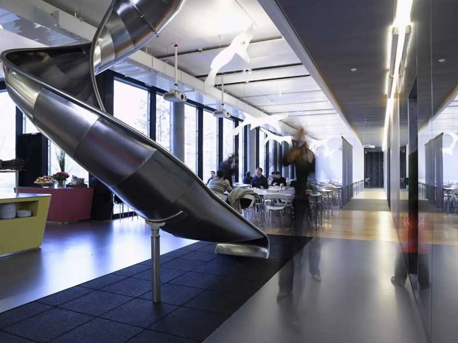 Google’s Zurich office, courtesy of e-architect
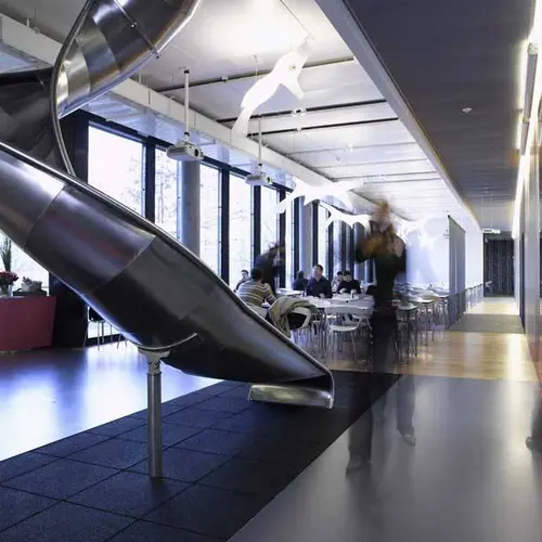
Despite the big movement toward more creative spaces, Royal College of Art Design professor Jeremy Myerson does not think they are always the answer. In a March 2016, Myerson argued that treating the workspace like a playground can detrimental to office design and Google’s practice of “infantilizing” their staff and workplace (with interior slides instead of stairs, and playgrounds) may work for Google but it’s not a one fit all strategy.
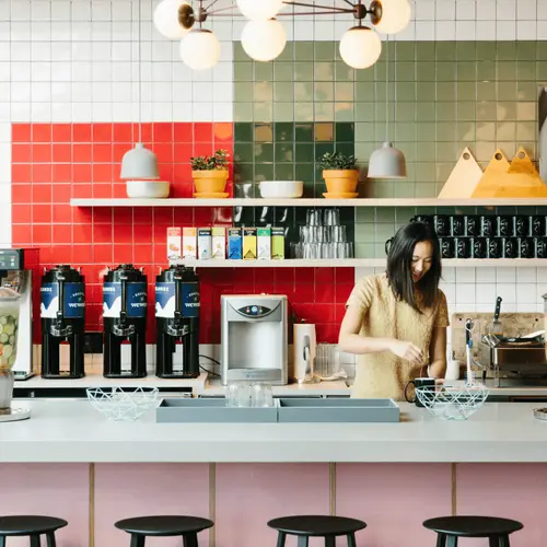
 A typical WeWork kitchen, courtesy of WeWork
Food and Drink Perks
A 2015 USA Today article highlighted a study (conducted by Peapod) that found the key to employee happiness is free food. “While the majority, 56%, of full-time employees are ‘extremely’ or ‘very’ happy with their current job, that number jumps to 67% among those who have access to free food, the survey of more than 1,000 full-time office workers found… Food at work is the most important to Millennials, vs. other age groups, and they are also the most likely to say they wish their employer offered more snack options. Snacks may even lure employees to new companies: 48% of respondents said that if they were looking for a new job, they would weigh company perks, including the availability of snacks, in their decision.”
Google co-founder Sergey Brin famously instructed his architects that, “No one should be more than 200 feet away from food.” Laszlo Bock, the Senior Vice President of Google’s People Operations, stated in his book, “Work Rules: Insights from Inside Google That Will Transform How You Live and Lead,” that serving good not only satisfies employees and keeps them in the office at mealtime but it is yet another way to create interaction and foster informal discussions. Amazingly, Google’s cafes offer 50,000 new menus every year.
Tetiana Danylchenko, Facebook’s Leadership recruiter, commented on LinkedIn, “I’m always in awe around how many healthy food options we have at Facebook. This is breakfast time Facebook Seattle office :). Healthy mind in a healthy body helps with high productivity and strong motivation to achieve great results all the time.”
Thrillist, the cities-based lifestyle website, has weekly happy hours and their office is always stocked with two bars and a Kegerator.
Warby Parker, the Soho-based eyeglasses retailer, provides free lunch three times a week from restaurants like Parm, the Meatball Shop, and Cafe Habana and they also provide Murray’s Bagels and Stumptown Coffee at their weekly team meetings. Warby Parker also has a weekly “lunch roulette” where send two team groups to lunch on the company’s tab.
Soho-based mortgage company Better offers free lunches. They also have chocolate and coffee in every room in the office and celebrations of product launches often include things like champagne and crepes made to order.
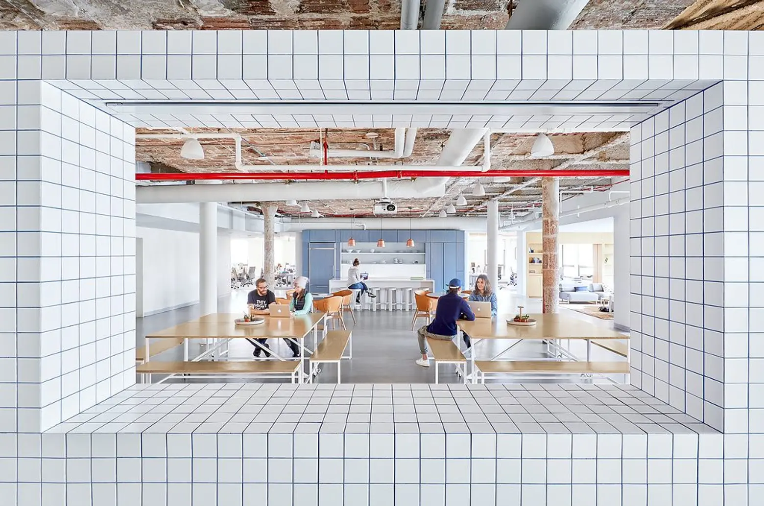
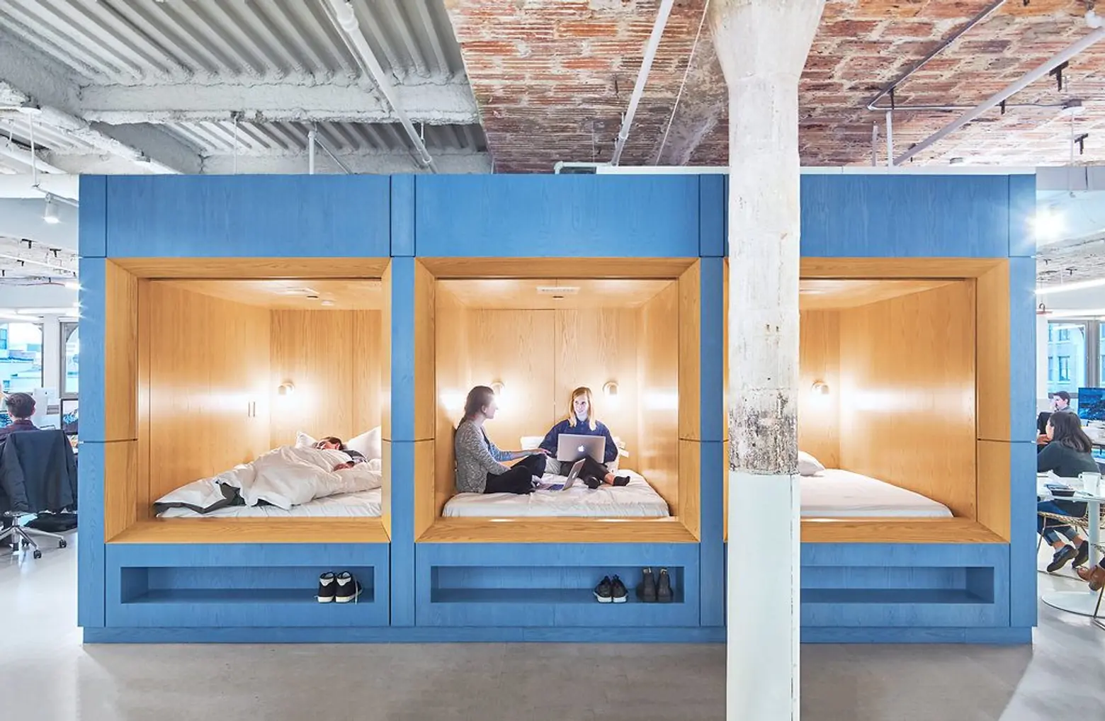 Casper’s Flatiron offices, by Aaron Thompson for Float Studio
Some other noteworthy perks
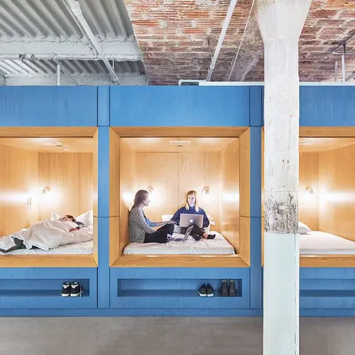
The mattress company Casper’s 32,000-square foot space at 230 Park Avenue South provides “nap pods” for employees. They also have three kitchens stocked with coffee, filtered and sparkling water, beer, fresh fruit, and cereal.
Anyone who interviews at the Williamsburg-based music internet site Genius receives $1,000 on the spot. For those that get a job there, vacation days aren’t counted, they offer free meals, free unlimited Seamless (online food ordering from local restaurants), free unlimited Fresh Direct, a free in-building gym, laundry, and showers.
The NoHo-based Meetup, an internet company that helps people find like souls in real life, offers fitness and smartphone reimbursements along with the most insane array of beer offered.
Sailthru, a NYC marketing tech company, offers unlimited vacation, a flexible working policy, and regular company-sponsored lunches, happy hours, and chair massages.

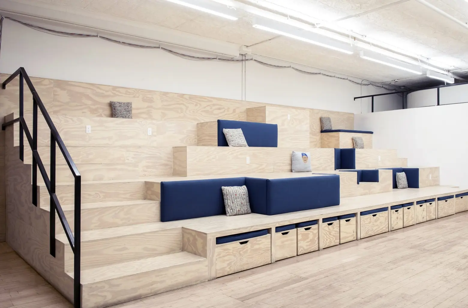 SeatGeek’s Soho offices, by Rayon Richards for Dani Arps
SeatGeek, in the heart of the Village, in addition to food and happy hour, offers monthly tickets perk to attend live events, a premium Spotify/Rdio account, and an annual Citibike pass among others perks.
RELATED:
